Rebranding with Design


Flag black

Press kit - Press release - Rebranding with Design - B+H Architects

Rebranding with Design

Hong Kong, Hong Kong

B+H Architects

Paul & Shark’s new flagship store demonstrates how design can refresh a brand


Shanghai, China, 2014-09-09 –

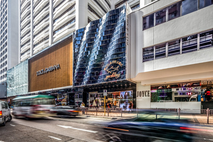
Looking to further expand into the Asian market, Italian luxury brand PAUL & SHARK embarked on a mission to renew its brand image. The first step: launch its Asian flagship store on Canton Road, Hong Kong. This would become the prototype for a new generation of PAUL & SHARK stores.


To better understand the personality of the brand, the B+H design team visited the PAUL & SHARK stores and workshops in Milan and Varese, Italy. Working closely with PAUL & SHARK CEO, Andrea Dini, B+H began work on a design that would reflect the fine craftsmanship and innovative spirit of the brand.


The iconic design concept of façade and interior of the flagship store was developed under the direction of Managing Principal Susanna Swee and Design Principal Jean Sebastien Bourdages.

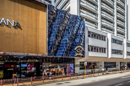
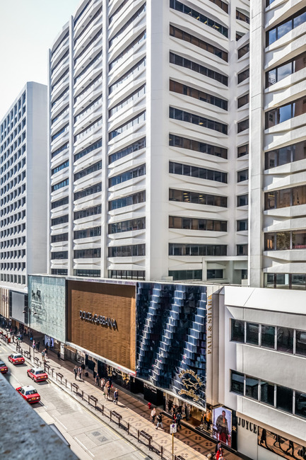
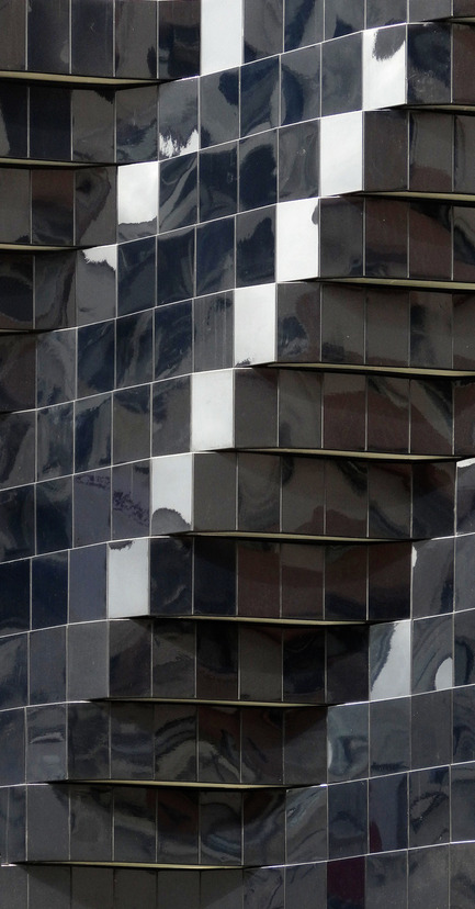
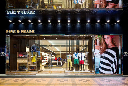
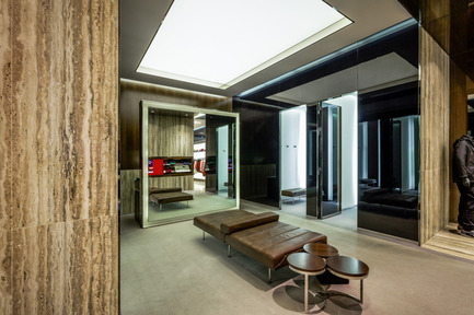
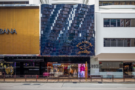
Spread across 3,500 square feet, the store adopts classic Italian minimalist elegance blended with contemporary archetypical elements such as steel, wood, glass and leather. Inspired by the rolling waves, the navy blue aluminum sheet patchwork of the façade creates shimmering curves and glittering ripples, emphasizing the PAUL & SHARK logo ahead of the abundance of luxury brands along Canton Road.

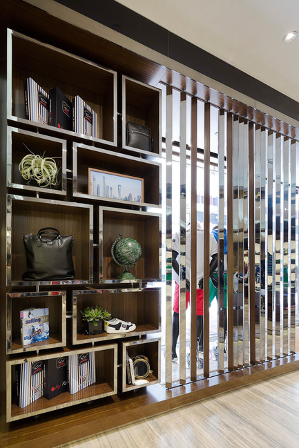
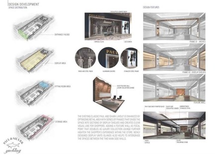
The main entrance and windows lead the way through vertical blinds of wood and steel, whose double sides offer visual transparency into the store and flexibility for window setting, along with an LED screen on the side showcasing the latest collection.

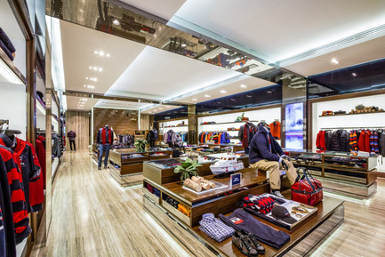
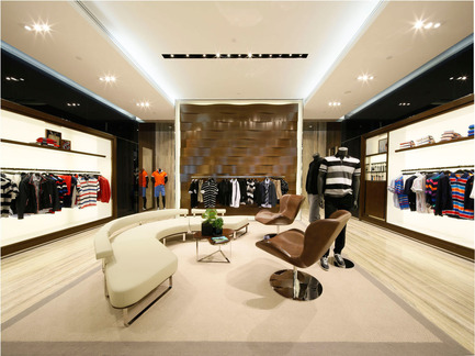
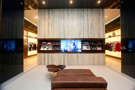
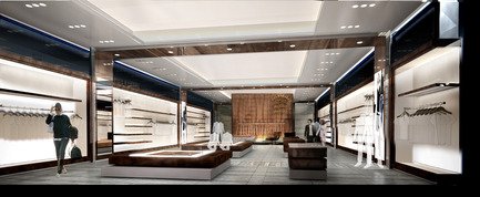
The arches, clad in glass and eucalyptus wood, optimize the existing retail area and divide the space into sections of display shelves. Eucalyptus shelves and back-lit translucent glass walls offer a clean palette, keeping the focus on the merchandise. The natural and warm ambiance is complemented by a wavy wood feature wall that echoes the exterior blue metal façade.

To further deliver brand consistency, B+H custom designed the clothing hangers and all luxury lounge furniture.

Following this success, the B+H design was applied in PAUL & SHARK stores in Milan, Mexico and Istanbul. B+H recently completed the new stores in Macau and Hong Kong, and is now supervising the Shanghai and Chengdu stores.

Principal in charge: Susana Swee

Design Director: Jean Sebastien Bourdages

Design team: Filip Piwowarczyk, Shukri Atta, Justice Wang, Livia Sima, Jason Gonzales

Lighting Design: AVA & Consultancy

Contractor, façade: Prorich Engineering Ltd.

Contractor, interior: Leung & Chang interiors Ltd.

Client: Paul&Shark and Imaginex

Completion: 2013

Project location: Shop G107, No.7-25 Canton Road, Tsim Sha Tsui, Kowloon, Hong Kong

B+H Architects:

B+H is a global, award-winning, full service design firm recognized for excellence in sustainable design, technical expertise and the delivery of complex, large-scale projects.  A legacy of over 60 years of design innovation and problem solving has endowed us with a depth of knowledge, skill and agility that benefits each client we serve, wherever they are in the world.

Working from offices in Toronto, Vancouver, Calgary, Seattle, Shanghai, Beijing, Hong Kong, Singapore, Ho Chi Minh City, Delhi, Doha, and Dubai, we are creating the framework around which people live their lives.  Our ability to span across scales and levels of complexity is evidenced by our large portfolio of work ranging from the planning of entire regions and cities through to the shaping of public spaces, individual buildings and interiors – each requiring the coordination of talented multidisciplinary teams.

We are committed to delivering high-performance and sustainable communities, buildings and environments that exceed client expectations, contribute to human well-being and enhance the health of our planet.


– 30 –
Media contact

  • B+H Architects

    In North America:

  • Mira Shenker, Marketing and Communications Manager
  • [email protected]
  • 416 596 2299 ext. 1012

    In Asia:

    Sissi Chu, Marketing and Communications Manager
    [email protected] 
    +86 21 3360 7861 ext.220
Press kit | 1184-01 - Press release | Rebranding with Design - B+H Architects - Commercial Architecture - Photo credit: Benoit Florencon

Photo credit:
Benoit Florencon


~

1.8 MB

Press kit | 1184-01 - Press release | Rebranding with Design - B+H Architects - Commercial Architecture - Inspired by the rolling waves, the navy blue aluminum sheet patchwork of the façade creates shimmering curves and glittering ripples, emphasizing the PAUL & SHARK logo ahead of the abundance of luxury brands along Canton Road. - Photo credit: Benoit Florencon

Inspired by the rolling waves, the navy blue aluminum sheet patchwork of the façade creates shimmering curves and glittering ripples, emphasizing the PAUL & SHARK logo ahead of the abundance of luxury brands along Canton Road.

Photo credit:
Benoit Florencon

Press kit | 1184-01 - Press release | Rebranding with Design - B+H Architects - Commercial Architecture - Photo credit: Benoit Florencon

Photo credit:
Benoit Florencon


~

430 KB

Press kit | 1184-01 - Press release | Rebranding with Design - B+H Architects - Commercial Architecture - Photo credit: Benoit Florencon

Inspired by the rolling waves, the navy blue aluminum sheet patchwork of the façade creates shimmering curves and glittering ripples, emphasizing the PAUL & SHARK logo ahead of the abundance of luxury brands along Canton Road.


~

440 KB

Press kit | 1184-01 - Press release | Rebranding with Design - B+H Architects - Commercial Architecture - The navy blue aluminum sheet patchwork of the façade creates shimmering curves and glittering ripples.  - Photo credit:  Benoit Florencon

The navy blue aluminum sheet patchwork of the façade creates shimmering curves and glittering ripples.

Photo credit:
Benoit Florencon

Press kit | 1184-01 - Press release | Rebranding with Design - B+H Architects - Commercial Architecture - The main entrance and windows lead the way through vertical blinds of wood and steel, whose double sides offer visual transparency into the store and flexibility for window setting, along with an LED screen on the side showcasing the latest collection. - Photo credit: Benoit Florencon

The main entrance and windows lead the way through vertical blinds of wood and steel, whose double sides offer visual transparency into the store and flexibility for window setting, along with an LED screen on the side showcasing the latest collection.

Photo credit:
Benoit Florencon

Press kit | 1184-01 - Press release | Rebranding with Design - B+H Architects - Commercial Architecture - Photo credit: Benoit Florencon

Photo credit:
Benoit Florencon


~

810 KB

Press kit | 1184-01 - Press release | Rebranding with Design - B+H Architects - Commercial Architecture - Photo credit:  Benoit Florencon

Photo credit:
Benoit Florencon


~

260 KB

Press kit | 1184-01 - Press release | Rebranding with Design - B+H Architects - Commercial Architecture - The natural and warm ambience is complemented by a wavy wood feature wall that echoes the exterior blue metal façade. - Photo credit: Benoit Florencon

The natural and warm ambience is complemented by a wavy wood feature wall that echoes the exterior blue metal façade.

Photo credit:
Benoit Florencon

Press kit | 1184-01 - Press release | Rebranding with Design - B+H Architects - Commercial Architecture - B+H custom designed all luxury lounge furniture. - Photo credit: Benoit Florencon

B+H custom designed all luxury lounge furniture.

Photo credit:
Benoit Florencon

Press kit | 1184-01 - Press release | Rebranding with Design - B+H Architects - Commercial Architecture - <br> - Photo credit: Benoit Florencon

Photo credit:
Benoit Florencon

Press kit | 1184-01 - Press release | Rebranding with Design - B+H Architects - Commercial Architecture - Photo credit: B+H Architects

Photo credit:
B+H Architects


~

66 KB

Press kit | 1184-01 - Press release | Rebranding with Design - B+H Architects - Commercial Architecture - Photo credit: B+H Architects

Photo credit:
B+H Architects


~

1.8 MB

Press kit | 1184-01 - Press release | Rebranding with Design - B+H Architects - Commercial Architecture - The main entrance and windows lead the way through vertical blinds of wood and steel, whose double sides were designed to offer visual transparency into the store and flexibility for window setting. - Photo credit: B+H Architects

The main entrance and windows lead the way through vertical blinds of wood and steel, whose double sides were designed to offer visual transparency into the store and flexibility for window setting.

Photo credit:
B+H Architects


Source link

Save This Post
Please login to bookmarkClose

Up Next

RECOMMENDED