
« LE GRAND STADE »
Joly Loiret
Requalification of the Stade équestre du Grand Parquet to Fontainebleau
Paris, France, 2012-06-18 –
Horse, display, prestige, arena, track, course, circuit, jumps, hillocks, slopes and mounds, terraces. Nature, forest, pine and birch, footpaths, walks across heathered heathland, plains, forest edge, clearings, grasses and wildflowers, banks, coppice. Such is the vocabulary that inspires this project. Words relating to equestrianism, landscape, and this exceptional location at the heart of the forest of Fontainebleau. Within this context, why not invent a real architecture-landscape, where boundaries between definitions blur and merge to create an appropriate intervention?
So, rather than imposing a statement here it seemed better to draw on the inherent qualities of this site, gently and subtly revealing and reusing them. The intervention that results is closer to a continuity of the natural landscape than a building in the usual sense of the word. The edges of the project envelope are undefined, allowing a functional, conceptual and formal continuity of space.
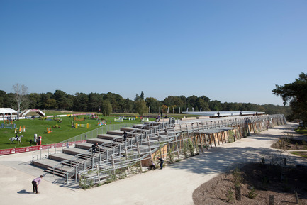
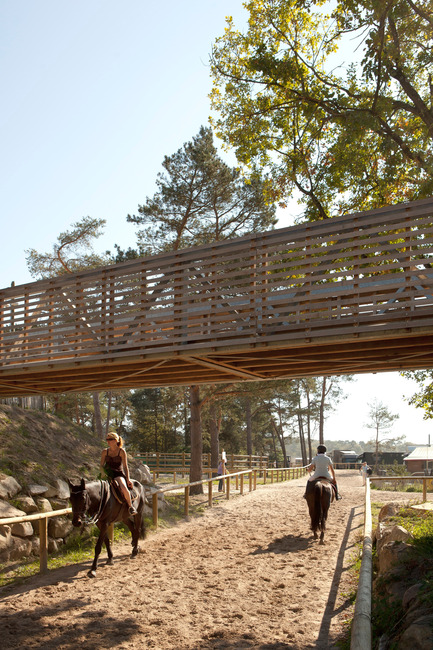
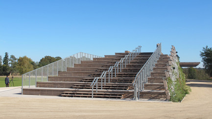
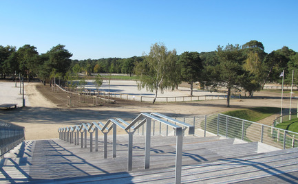
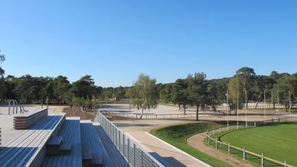
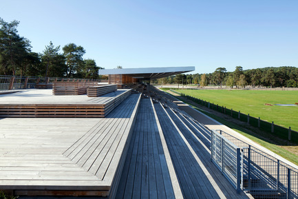
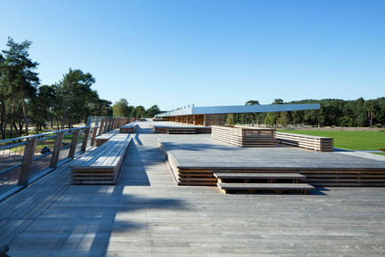
A key part of this relationship with the landscape is a pedestrian circuit leading around the whole of the site. This circuit is a public walkway, punctuated with elements of both the equestrian centre and the forest. Beginning at the entrance, the pathway crosses the exhibitors area, runs the length of the horses rest area, passes on a footbridge above riders on horseback, dips under the pine trees, runs alongside the collecting ring then the water jump, falls in line with the terraces, before climbing gently up to the top of the roof of the building, giving visitors plunging panoramic views over the arenas. Descending from the roof, this boardwalk becomes a grand staircase that steps down through the levels of wooden terraces returning the visitor to the main entrance at the bottom.
Staircases at regular intervals along the rooftop boardwalk give access to the stands and link to ground level circulation.
This pedestrian circuit creates a loop around all of the Grand Parquet’s paddocks and sand arenas, collecting them together in a sort of forest clearing dedicated to sport.
The creation of this clearing – the competition area – is part of the overarching aim to redefine the various programmatic zones of this equestrian centre. It is bordered to the north by the (replanted) edge of the forest, creating a spectacular backdrop. To the south and from east to west, the area of mobile and permanent horse stalls has been reconfigured to run parallel to the edge of the site, and the exhibitors area has moved nearer to the entrance and the parking for staff and officials.
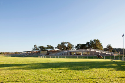
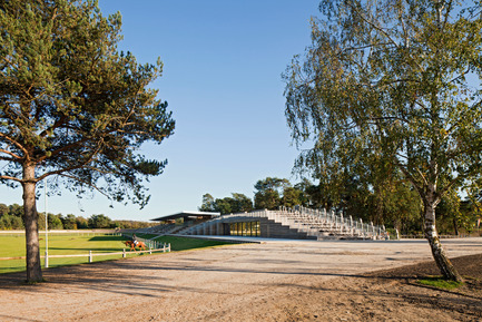
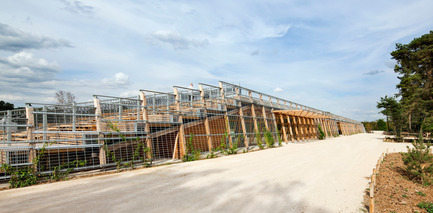
A giant bank of wood and climbing flowers, the « landscape-building » has been generated by the ‘morphing’ – or modelling – of an embankment, and so fits within the pre-existing forms of this site.
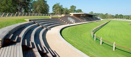
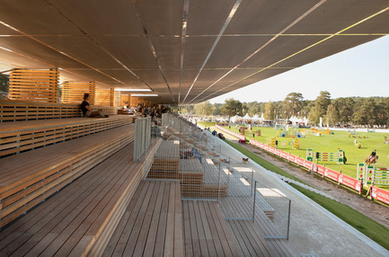
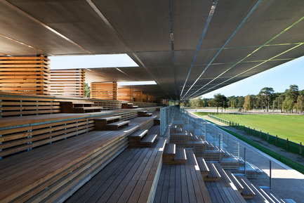
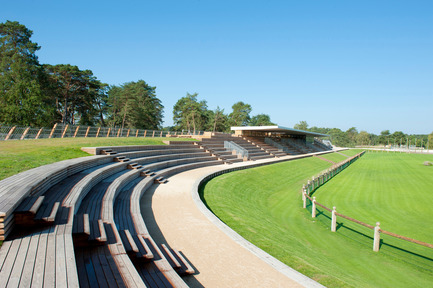
The fusion of building with tiered seating, tiered seating with terrace, terrace with embankment, embankment with path, path with forest edge, forest edge with forest, positions the building firmly in its natural setting. The north side is set with tiered seating made of black locust wood, which extends the lines of the terraces. These strong horizontals continue in an arc to the east, hugging the edge of the main arena.
To the south, at the entrance, a sloping wall of climbing plants – a direct continuation of the grass slopes to either side – creates a visual and solar screen for the building behind.Running the pedestrian walkway across the highest point of this roof anchors the building firmly within the spatial organisation of the site. It becomes a support for the flow of visitors. Its low-lying shape minimises visual impact and limits any dominance its volume might otherwise have had.
The building’s shape and the use of materials are also part of this desire to integrate the project into its surroundings.
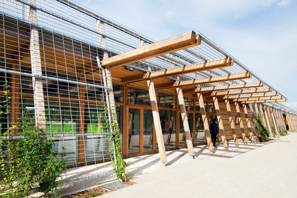
THE MAIN BUILDING: THE BUILDING ENVELOPE The building section takes its shape from the angle of the south facing sloped façade, the line of the rooftop boardwalk and the north facing side cut into by its tiered seating (Depth 90cm, height 45cm).On the building’s south side, a 2m grid provides the framework for the first layer of façade. Standardised façade panels of either wood or glass are slotted into a wooden structural frame, providing insulation and waterproofing
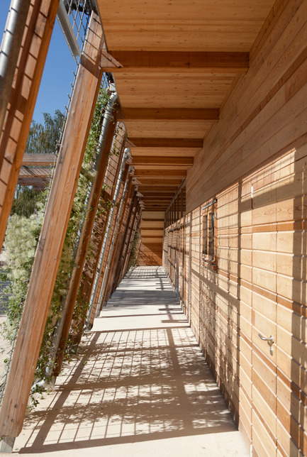
. The second façade is a layer of lightweight screen to support climbing plants that will grow up to provide solar screening in summer and die back revealing views outside in winter.On the north side of the building and on the roof, the terraced seating and the black locust wood boardwalk decking create the façade/ roof (ventilated, on blocks, on waterproofing).
The 45cm vertical measure of the seating, is found in the design of wooden boarded sections throughout the project; for example the ends of the tiered seating to the north are visually extended into the passages that run through the building and in the covered walkway along the south façade. In the same way that the sloping planted façade on the south side of the building flows directly out of the sloped grass bank next to it, so, to the north, this continuity is achieved with the use of wood (the stands and the tiered seating) gradually following the topography.
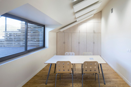
Wood dominates as a material. The visible wooden structure in white spruce creates the ceiling and partitioning, whilst suspended ceilings and built in furniture are made of white pine.
PROJECT DESCRIPTION The project comprises a total redevelopment of the site (25 hectares), the construction of a new main building, and a number of ancillary buildings.Generally, the site has been lightly re-landscaped whilst the stabling and parking areas are completely rebuilt. Routes for pedestrian visitors, vehicles and riders have been entirely reorganised in order to separate them as much as possible (creating footbridges that cross above routes for horses and jockeys, double circulation etc)
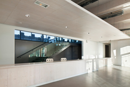
Main building The main building is divided into 3 clearly defined functional areas, as requested by the client :1-A public area comprising restaurant, kitchens and public toilets ;
2-An area for competition officials and event organisers (meeting rooms, judges area, press room) ;
3- The equestrian centre’s offices and workshops.
The project divides the building into three distinct areas, each is autonomous with its own discreet entrance. These three areas are separated by two large passages that lead through the building from the entrance zone towards the stands. The autonomy of these three spaces allows the site to flexibly accommodate a variety of uses.
These separate entities are grouped together inside the envelope of the main building and are linked by the covered walkway running along the south side of the building, giving the building a coherence and compact aspect. All spaces are on one floor level for reasons of functional simplicity, accessibility and legibility.
The restaurant is on the west side of the building occupying a strategic position where the pedestrian circuit around the site meets the exhibitors’ area.
Facilities for event officials and organisers are at the centre of the building. These spaces benefit from an excellent view over the arena and easy access from the parking area for staff, officials and exhibitors.
The equestrian centre at the buildings’ eastern end, is also easily accessed from the staff parking area. It includes a delivery depot for the centre’s workshops, that links via a service road to the store to the north of the arena.
The terraces The eastern terraces are designed to read as a continuation of the grandstand. They are made of wood (black locust) on an aluminium frame. Height: 0.45m, Depth: 0.90m. Total area: around 1000m2 The footbridges Two footbridges in steel and wood (identical decking to that on the building) feature as part of the pedestrian circuit. They are placed sufficiently high (3.40m clearance) to not bother horses passing underneath and are wide enough to allow visitors to stop and look down onto the path below. One of the footbridges is also accessible to service and maintenance vehicles of less than 3.5T. Stabling and parking New permanent stabling (in wood) runs parallel to the perimeter wall, a direct continuation of pre-existing stables on the site.Large open areas to accommodate temporary horse boxes have also been created. These are interspersed with generous wooded areas to break up their mass. As the trees mature, these wooded areas can also be used for rest and relaxation by visiting competitors and their teams. 130 parking spaces for large vehicles/trucks have also been created near to the stabling. Underground toilet block A ‘buried’ toilet block is planned beneath the supports of the footbridge to the north of the zone for horse boxes and temporary stabling. Made of masonry, it will be directly accessible from the stables, for both jockeys and members of the public. The idea is to hide it in the landscape to avoid adding extra structures to the site. Washrooms and showers (competitors entrance) Washrooms and a shower block for the jockeys will be located to the left of the competitors’ entrance. This will be a wooden building similar in design to the permanent stables. Aligned to the (protected) boundary wall, this new construction will mark one side of the entrance to the site, with the stables symmetrically marking the other.
Next to this building will be a straw loft (existing, moved here) and an area for refuse. Entrance kiosks Wooden entrance kiosks are located to the right of the competitors’ entrance and pedestrian’s entrance. Store The store is on the site of a former open-air storage area. It is approximately 600m2 (of which 450m2 covered). To minimise the impact of this building, the surrounding grass banks have been slightly raised and a green roof added. From a distance, the roof disappears into the landscape. Data sheet: LOCATION: FONTAINEBLEAU FOREST
COMMISSION: OPEN COMPETITION.
CLIENT: COMMUNAUTE DE COMMUNES FONTAINEBLEAU-AVON
AREA: 2 000 M² + 25 H LANDSCAPING
VALUE: 9.3 M€ (inc. terraces and landscaping)
DATE: CONTRACT AWARDED JUNE 2007
COMPLETION: 2012 (PHASES)
DESIGN TEAM: JOLY&LOIRET (ARCHITECT) with EVP (STRUCTURES), ALTO (ENERGY AND ENVIRONMENTAL CONSULTANT), FORGUE (QUANTITY SURVEYOR) MAP (LANDSCAPE), URBATEC (CIVIL ENGINEER)
CONTRACTORS:
EXTERIOR : TP GOULARD (CIVIL ENGINEER), INEO (WATER/WATERING SYSTEMS), FORCLUM (ELECTRICIAN.), ISS (PLANTING), SEB (EXTERIOR WOODWORK),
BUILDINGS: BOYER (DEMOLITION/HARD LANDSCAPING), BELLIARD FRERES, (TIMBER WORK/WATERPROOFING), R2C (METAL WORK/ IRONWORK), STE BONNARDEL (WOODEN BOARDING/DECKING/INTERIOR AND EXTERIOR JOINERY), SUD METALLERIE SAS (EXTERIOR METAL WORK), SERTAC SARL (PARTITIONS/SUSPENDED CEILINGS), TECHOPOSE & BEDEL (TILES), LEROY SEB DECO (PAINTS), THYSSEN KRUP (LIFTS), CLIMAIRTEC (PLUMBING), LEROUX GONSSARD (HVAC), AIMEDIEU (ELECTRICIAN) NANCY CHEVAL (STABLING)
ABOUT JOLY&LOIRET
Paul-Emmanuel Loiret and Serge Joly met in 1993 at the Ecole Supérieure d’Architecture de Paris la Seine. Completing their diplomas in 2001 and 2000 respectively, until 2006-7 they worked in French and foreign architectural practices of international renown, notably at Ateliers Jean Nouvel, Renzo Piano, Jacques Ferrier and for the Services Economiques des Ambassades de France in various countries in Africa.
These years of training were also marked by opportunities for travel around the world. One spent time in Canada, Africa, south and central America, the other criss-crossing Asia, both having travelled throughout Europe.
In 2003, having already embarked upon their professional careers, they decided to work together under the name ‘architecture system’. Between 2003-6, in parallel with their work for other architects, they participated in a number of international architecture competitions and undertook small private projects.
They were awarded the prestigious nomination by the French Ministry of Culture to the ‘Nouveaux Albums de la Jeune Architecture’ for 2005-6; a prize given to 20 architectural practices aged under 35 in recognition of their work and their potential for the future. Following this award, they founded JOLY&LOIRET.
Since then, the office has had between 6 and 8 employees. Work has diversified both in the public and private sector, notably for schools, sporting and cultural public commissions, but also in exhibition design, housing and offices.
In 2010, Joly&Loiret were shortlisted for the PRIX DE LA PREMIERE OEUVRE 2010, a prize awarded by the publishers MONITEUR, for their project ‘Les Ganivelles” (HQ for the French Surfing Federation and a new gastronomic restaurant in Hossegor), and received a commendation for the category, Best public project, City of Bordeaux at the PRIX AGORA, for their project “Les 3 mondes, Berge du Lac school)
Paul-Emmanuel Loiret and Serge Joly also teach at various Ecoles Supérieure d’Architecture.
A creative approach rooted in environmental contextOver time, Paul-Emmanuel Loiret and Serge Joly have forged a broad architectural and environmental approach with a sensitivity towards a simple, vernacular architecture, informed by local cultures and contexts. Today their objective is to create an architecture that is environmentally respectful and culturally representative.
In the manner of a landscape designer or land artist, the office’s projects are more than simply functional. They are cultural, determined by a sense of place, its history, its form, its materials and its textures with the aim of creating a space to fit the local context. Each project, conceived with respect for the use of energy and resources, reveals and reflects its environs, as if it had risen from nature.
Most importantly, the office’s projects aspire to be sensitive, efficient, dynamic, sustainable, appropriate and alive, to be poetic, to touch the people who use them. Far from having a formal ideology, Joly&Loiret strive to build an architecture that is concerned not with its own singular presence, but with the actions and events that it might engender.
– 30 –
-
- Serge Joly
- [email protected]
- 33 45 80 33 41
M. Denance Photographe
~
14 MB
HOTOGRAPHE
~
25 MB
F. Delangle Photographe
~
14 MB
HOTOGRAPHE
~
4.1 MB
M. Denance Photographe
~
7.6 MB
F. Delangle Photographe
~
60 MB
F. Delangle Photographe
~
49 MB
F. Delangle Photographe
~
14 MB
Pe. Loiret Photographe
~
20 MB
Pe. Loiret Photographe
~
7.6 MB
Pe. Loiret Photographe
~
3 MB
Pe. Loiret Photographe
~
3.9 MB
Pe. Loiret Photographe
~
1.8 MB
F. Delangle Photographe
~
15 MB
M. Denance Photographe
~
20 MB
M. Denance Photographe
~
14 MB
M. Denance Photographe
~
12 MB


