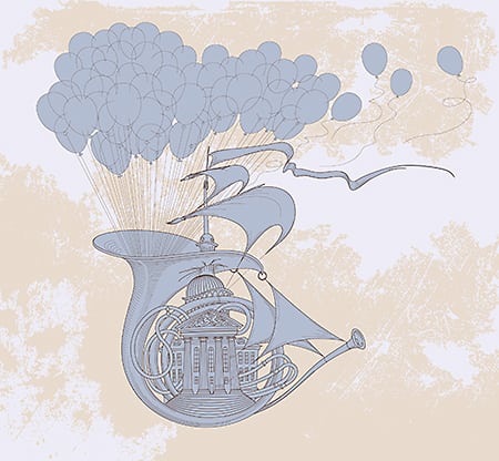
Is your poster layout working? Want some quick tips and tricks on how to make your design better?
Watch Master Chris Do design on the fly to come up with solutions
for design problems you might be having. He shows how to break items down into groups and why/where he places elements on the page to enhance the design.
Original poster designed by Darian Rosebrook
https://darianrosebrook.com/
This video is a cut down from:
How To Improve Your Layout and Typography Critique
___
This is the Futur of Education— Disrupting the design education paradigm.
Want a deeper dive? Typography, Lettering, Sales & Marketing, Social Media and The Business of Design courses available here:
https://goo.gl/bRt5qd
—
Love the content? Become a sustaining member for $5/mo today.
https://goo.gl/uKcJ3N
Our BOOKLIST:
https://goo.gl/onrdxr
Kits & Proposals:
https://goo.gl/mSjuWQ
Visit our website:
https://www.thefutur.com
FREE resources:
https://goo.gl/Qh6gHr
—
OUR AFFILIATE LINKS
Skillshare: https://goo.gl/YCo2uT
Amazon: https://goo.gl/K1bIhg
Creative Market: https://goo.gl/g4jlTE
—
Futur Podcast on iTunes: 🎙
https://itunes.apple.com/us/podcast/the-futur/id1209219220?mt=2
—
Connect with us online:
https://www.facebook.com/theFuturisHere/
Tweets by thefuturishere
https://www.instagram.com/thefuturishere/
—
Credits:
Executive Producer– Chris Do
Host– Chris Do
Director– Erica Pead
Cinematography– Aaron Szekely, Mark Contreras
Editor– Stewart Schuster, Erica Pead
Futur Theme Music – Adam Sanborne http://www.adamsanborne.com
Annotations– Isaiah Nwukor
Typefaces: Futura, Din, Helvetica Neue
Futur theme song— Adam Sanborne
source


