
A New Oasis Off London’s Oxford Street
Make Architects
Make Architects launches Rathbone Square
London, United Kingdom, 2018-04-17 –
A former Royal Mail sorting office site, just off London’s Oxford Street has been transformed into a high-quality mixed use development with a new publicly accessible garden, by Make Architects.
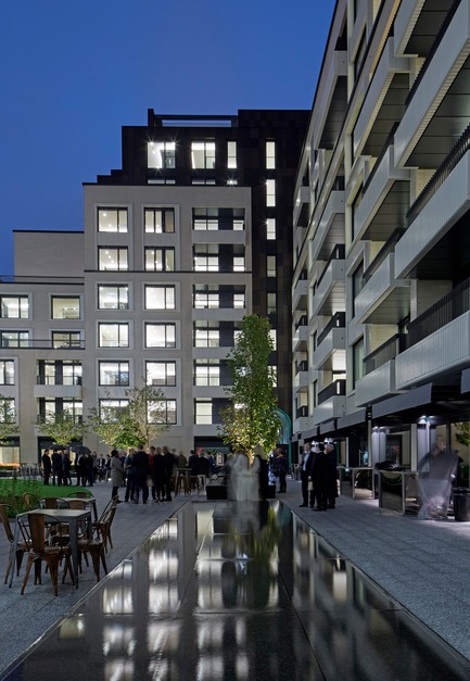
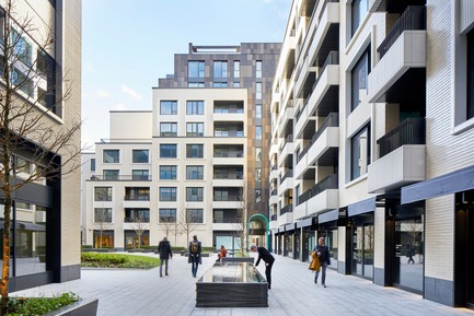
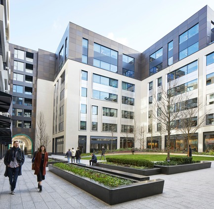
Designed as a sorting office in 1951, the site was formerly inaccessible to the public when it was bought by London developer Great Portland Estates plc (GPE). Now, two L-shaped blocks stepping from six to nine storeys surround a garden that takes up 20% of the GDA.
From the outset, Make worked with Publica to choreograph the routes and connections, and Gustafson Porter + Bowman to design the garden square. The garden gives a feeling of discovery that is typical of Fitzrovia, and provides an oasis away from the hubbub of Oxford Street.
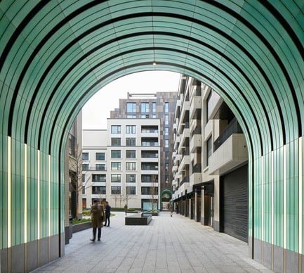
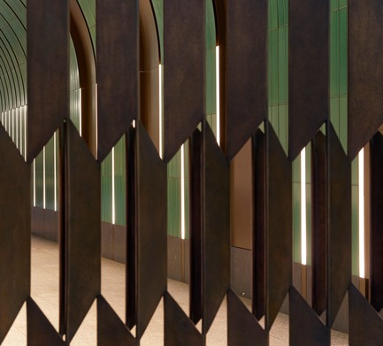
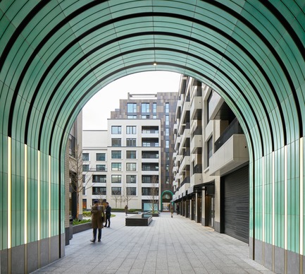
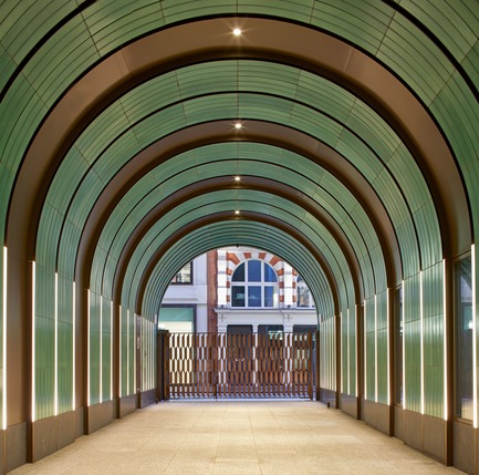
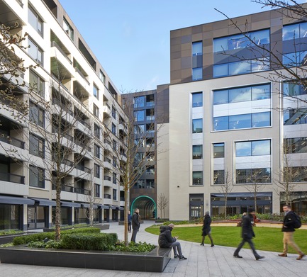
The routes through the scheme vary: some are wide and open to the sky, entering through patinated bronze gates designed by Robert Orchardson and meandering through the garden, while others are covered and less obvious, with jade green glazed ceramic passageways that evoke the precedent of the 18th-century Newman Passage. Here the bullnose detail and crackle glaze finish encapsulate the high level of detail and finish that has gone into the project.
The proportions of these passageways vary too: one is narrower, with a glass bridge that connects the residential elements to the north and west of the site, while the other is broader. The ceramic archways are punctuated by windows that allow glimpses into the retail units behind.
The building and routes have deliberately been designed as the backdrop to the garden, with glazed ceramic brickwork reflecting the colours and seasons, and the passageways providing a glimpse of the sensory experience beyond and providing a heightened sense of arrival.
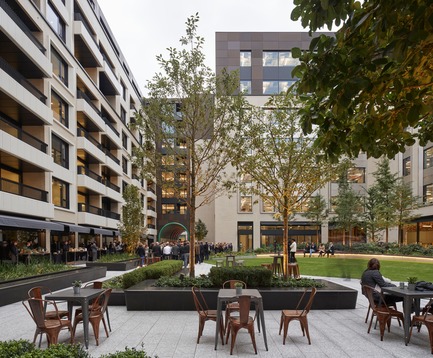
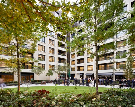
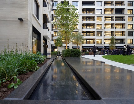
The 1,800 m2 garden complements the architecture with a series of spaces that include a rich planting palette, water features and public seating. A central lawn is framed by semi-mature trees, shrubs and planting. The lawn rises gently towards a tactile curved wooden bench that divides the lawn from the planting, its dark colour contrasting with the surrounding planting and stone.
The buildings’ reach nine storeys at its tallest on the northern side and stepping down to stitch in with the eclectic Fitzrovian architecture, which mixes Victorian, Georgian and Edwardian styles.
The facade has been broken down into vertical elements to address the street. Likewise, the uses are contextual with the commercial elements on the south side of the plot and the apartments and retail linked to the residential areas to the north. The massing on the south-west side is stepped to draw light into the garden during the afternoon and evening.
Brick, ceramics and specialist metals form the material palette, picking up on the rich detailing in the area. It is largely monochrome, promoting smooth, clean lines and allowing the garden and the jade-green passageways to be the main feature. The street-facing elements have a clay-faced brick that is a similar tone but without the glazed finish of the internal facing bricks. The proportions of the bricks are longer than average, with recessed horizontal mortar joints, while the vertical joint is flush to emphasise the strong sense of horizontality in the materials. The uppermost floors step back from the street line and are clad in a dark bronze anodised aluminium. This spills down to provide a material distinction that divides and connects the different uses.
The materials and their proportions have been selected to express the uses of the building. The scale of the commercial element—fully let to Facebook for its UK headquarters—is much bigger, with large linear picture windows and full-width dappled, stainless steel spandrel panels. In contrast, the residential element has more appropriately sized glazing, and is far more tactile and playful. The ceramics are light in colour; some are handmade, some are pressed, and some are extruded to give a variety of finishes, reflections and shadows, but each serves to show a certain level of detail and quality.
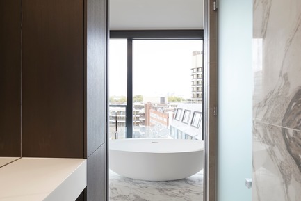
There are 160 apartments in total, with 50 different types to minimise repetition and add a sense of uniqueness. Apartments have their own outside space, be it a balcony or a terrace; these are expressed with either a crisp glass balustrade on the upper levels or with rolled, ribbed, ceramic balconies with steel spindles and crafted timber handrails.
Graham Longman, project architect, said: “This project is indicative of a London that is changing—adapting for Crossrail but also adapting for people. It has successfully combined and expressed a number of uses and added value—not only for the end-users but also the general public, through the delivery of a new, publicly accessible space at its heart. We look forward to seeing it evolve over the coming years.”
Data Sheet
Client name—Great Portland Estates plc
Location—London
Architects—Make Architects
Project Manager-Buro Four
Contractors—Lend Lease
Structural Engineers—AKTII
Service Engineers—Hilson Moran
Landscape Architects-Gustafson Porter + Bowman
Public Realm consultants-Publica
Budget—undisclosed
Project End Date—October 2017
About Make Architects
Make is an award-winning international architectural practice with a reputation for challenging convention and pursuing design excellence. Since they opened in 2004, they’ve worked on more than 1,300 projects worldwide covering a wide range of sectors, delivering 68 built schemes from studios across three continents. Their work is inspired by a singular purpose; to design the best buildings, places and spaces in the world.
– 30 –
- Make Architects
- Sarah Worth, PR Manager
- [email protected]
- +44(0)2037955373
Edmund Sumner
Edmund Sumner
Edmund Sumner
Robin Gautier
Robin Gautier
Edmund Sumner
Edmund Sumner
Make Architects
Make Architects
Edmund Sumner
Make Architects
Make Architects
Make Architects
Make Architects
Make Architects
~
210 MB
Make Architects
Make Architects


