World Interiors News Awards Ceremony 2016
World Interiors News
London, United Kingdom, 2017-03-07 –
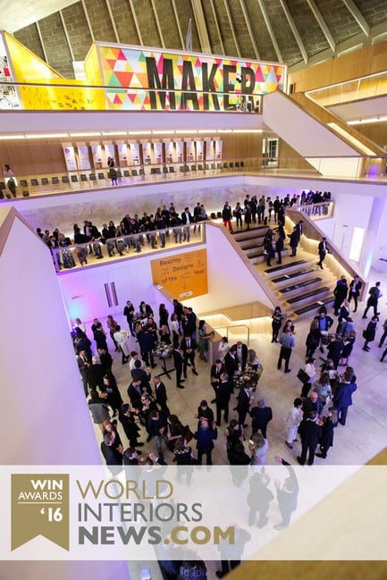
The recent World Interiors News Awards 2016 gala evening was truly a night to remember, in the very best of ways. The great and the good of the interiors world gathered together from around the globe for a glittering celebration of some of the industry’s most outstanding projects and products – all against the impressive backdrop of London’s iconic new Design Museum.
Being a WIN Awards winner, or even making it to the shortlist, is a remarkable achievement. It’s something all the designers featured in this celebratory compilation should be truly proud of; because each distinguished and discerning judge on the World Interiors News panel is appointed under the strict criteria of reputation, expertise, and their passionately held views on what constitutes excellence in design.
Once again, World Interiors News congratulates all its deserving winners.
—
The WIN Awards 2017 are now open for entries!
– 30 –
- World Interiors News
- Steven Penney, Awards Manager
- [email protected]
- +44 (0)1273 201 117
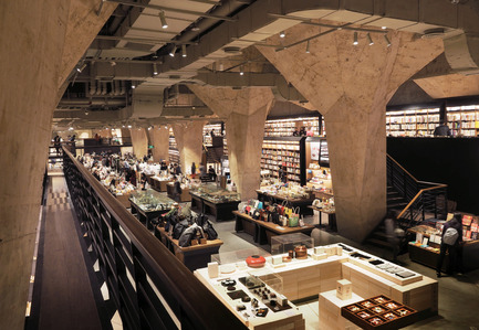
Fangsuo Bookstore in Chengdu by Chu Chih Kang Space Design
Chu Chih Kang’s initial proposal was centered around “The Secret Scripture Library”. Scripture libraries have been found either in or under Buddhist temples for centuries and have an extended meaning of stored wisdom in Mandarin Chinese. The team found significant historical connections to the site, such as links to Daci Temple and one of the most famous monks in Buddhism – Xuan Zang of the Tang dynasty.
JUDGES’ COMMENT
‘Fangsuo is designed to be a bookstore, but they have actually called it a cathedral “carrying wisdom, culture and attitude”. That’s a high aim, and yet they’ve managed to pull it off. It has this exciting feel about it that makes you want to explore and discover all the different floors.’
Chu Chih Kang Space Design
1888 Certified by TomMarkHenry
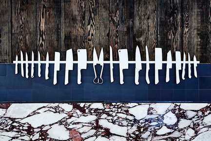
1888 Certified is a unique butcher in Double Bay. Their product is sustainable, grass-fed and hormone free. The clients being fourth generation farmers are authentic and steadfast in their sustainable practices. Therefore the interior had to align with this ethos, and help to tell the story of the producers, and it was important to the clients that their customers engaged with their story.
JUDGES’ COMMENT
‘It’s beautiful and elegant; I particularly like the choice of marble that looks like the marbling on meat, and yet it elevates it and makes it rather special. The display of all the knives is arranged so beautifully that you would be tempted to go in to see the “poetry of butchering” for yourself.’
TomMarkHenry
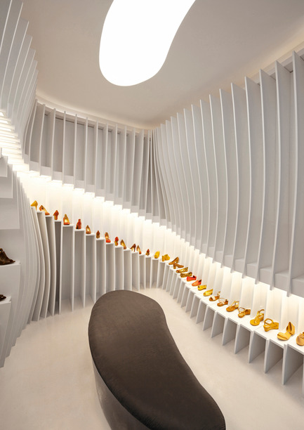
Importance of Walking Store by Praxis d’Architecture
An unexpected situation with the lease required the design for the space to be as economical as possible and fast to build. Furthermore, the shoe shelves were intended to be self-supporting, movable and ready for re-assembling. Effectively an independent piece of furniture, the installation could be moved easily and with minimal wastage.
JUDGES’ COMMENT
‘It’s notoriously difficult to display shoes, but the storage system they have used does the job and makes the space dramatic and dynamic at the same time. Using a simple stepped element is a designed piece that can be easily manufactured and installed and has created a unified environment that is both flexible and incredibly exciting.’
Praxis d’Architecture
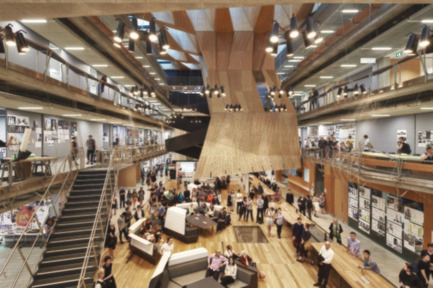
1888 Certified by TomMarkHenry
1888 Certified is a unique butcher in Double Bay. Their product is sustainable, grass-fed and hormone free. The clients being fourth generation farmers are authentic and steadfast in their sustainable practices. Therefore the interior had to align with this ethos, and help to tell the story of the producers, and it was important to the clients that their customers engaged with their story.
JUDGES’ COMMENT
‘It’s beautiful and elegant; I particularly like the choice of marble that looks like the marbling on meat, and yet it elevates it and makes it rather special. The display of all the knives is arranged so beautifully that you would be tempted to go in to see the “poetry of butchering” for yourself.’
JOHN WARDLE ARCHITECTS AND NADAAA IN COLLABORATION
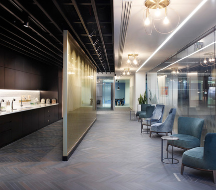
Estée Lauder Companies by MCM Architecture
The relocation of The Estée Lauder Companies UK & Ireland to One Fitzroy is the first time globally, that the business has brought together all of its brands and training facilities under one roof.
The vision for the new headquarters centered around the themes of family, home and community to support collaboration, agility, creativity and innovation.
JUDGES’ COMMENTS
‘A beautiful translation of the brand as an experience with a high end retail quality to the space, you literally live the brand as you walk through it. Lovely detailing, and generally a very strong design ethos throughout.’
MCM Architecture
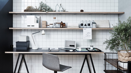
LK + RIGIDESIGN OFFICE DESIGN by RIGIDESIGN
RIGIdesign is a young design team based in Shanghai. The site is located in a creative complex building, which was reconstructed from a former factory. Founder Kai Liu’s brief for their new office was to create a space that would be both ‘emotional and simple with a connection with the people.’
JUDGES’ COMMENT
‘I love the clarity and simplicity of the RIGIdesign office and the integration of graphics and colours, but also the friendliness and homeliness of the project. It’s a beautiful piece of design.’
RIGIdesign
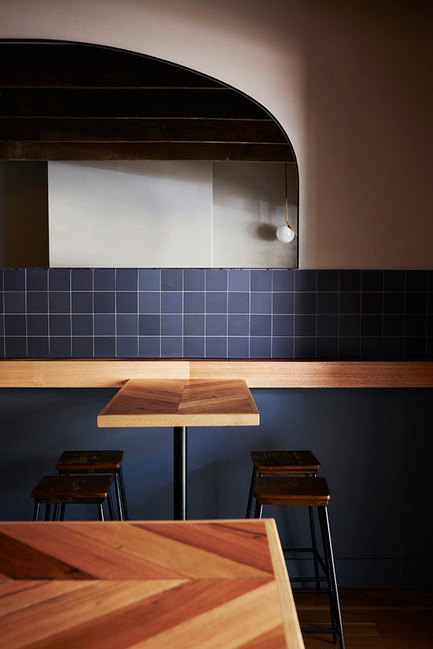
Dead Ringer by TomMarkHenry
The aim of Dead Ringer was to create an unassuming and relaxed venue as a place to enjoy high a calibre food and drink offering in an environment that was not ostentatious or specifically themed in any way.
The strongest message that came through in the client brief was there was to be strictly no theme, and they did not want to be a carbon copy of something that has been done before.
JUDGES’ COMMENT
‘Clever solutions within tight budget limitations using carefully selected light fittings and a tonal palette to create a simple and elegant space.’
TomMarkHenry
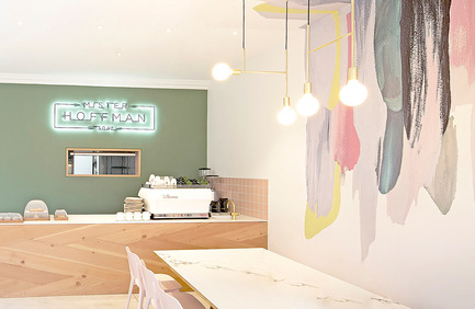
Mister Hoffman by Joanne Motee
Mister Hoffman is interior design that is true to the practice’s philosophy of Inspired Living. Through thoughtful curation of space, pieces and colour, executed in a cohesive manner, a small space has been transformed to maximise its commercial capacity without compromising its creative credentials.
JUDGES’ COMMENT
‘We all appreciated how the minimalism has been made to work in a welcoming way. It’s refreshing but not cold. The compositions are thorough and composed. There are some quirky items in there as well – altogether a very optimistic project.’
Joanne Motee
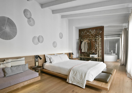
Puro Hotel by OHLAB
Puro is an iconic 22 room boutique hotel located in the heart of La Lonja, in the historical centre of Palma.
Adapting itself to the different existing buildings, the hotel has an irregular configuration. The refurbishment project by OHLAB takes advantage of that complexity as a potential tool to generate unexpected and unique spaces where each room is different from the next. The selection of natural and local materials emphasizing the Mediterranean essence has been very important.
JUDGES’ COMMENTS
‘Small in scale, this is a contemporary design hotel within an 18th century palace in the old town of Palma de Mallorca. The team at OHLAB have managed to magnificently plan a rather difficult series of existing spaces with refreshing variety whilst pursuing design distinction in all aspects of the bespoke interior details. The resulting palette of natural material choices, soft neutral colours and innovative details is simplistic and effective in equal measure.’
OHLAB
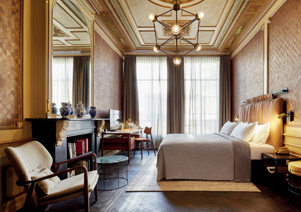
The Hoxton Amsterdam by Nicemakers
With each new project a local team is appointed to ensure that the local city character is captured. To make sure the project is given the right energy and that the right balance between public spaces and hotel rooms is achieved, the interior designers were involved at an early stage. Without a standard set of requirements, the designers had creative freedom, with the only objective to ensure a homely feeling throughout. This maintained the essence of The Hoxton identity while offering a true taste of local culture.
JUDGES’ COMMENT
‘An adaptive re-use, sympathetically and innovatively designed by the team at Nicemakers. Created by connecting five 17th century canal houses, the design team showed great talent in blending the historic elements of the building and a measurable sense of place and flair in modernising the interior design’.
Nicemakers
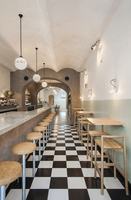
OGGI by studio -gram
The brief was simple; the client wanted a bright interior, with a kitchen on show, a direct reaction to the moody, dimly lit spaces of the local hospitality scene.
Oggi is a simple and subdued interior, with a playful personality, informed by the squares and piazzas of Italy. The repetition, the materiality and the formal nature of these outdoor spaces have all influenced the outcome.
JUDGES’ COMMENT
‘Oggi has an immediately recognizable Italian style of the period between the two wars. It has very soft geometry with a beautiful pared down palette of colours and an intimate section of alcoves. It also has a very bright and airy feel for such a long narrow space along with a long bar which you can imagine being full all the time.’
studio -gram
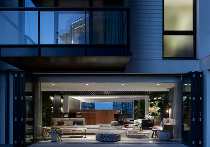
Kings Cross Central – Plimsoll by Johnson Naylor
Johnson Naylor created the interior architecture of all apartments and penthouses in the Plimsoll Buildings. They were also responsible for the design of the Entrance Lobby, the Residents Facilities, which include a lounge, dining room and gym, and the interiors of the Winter Garden, working with landscape designers Dan Pearson Studio.
The interior architecture of the apartments responds to the unique context and surroundings of Kings Cross. The spacial composition and vertical and horizontal rhythm of the interior work in harmony with the architecture.
JUDGES’ COMMENT
‘Johnson Naylor have commissioned a fantastic selection of bespoke furnishings and curated artwork as well as using beautiful materials including American walnut and brass throughout the project. Altogether a stunning urban development that responds to the unique context of King’s Cross.’
Johnson Naylor
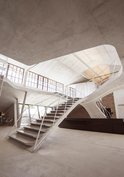
Loft Panzerhalle by smartvoll architekten
smartvoll won a competition in which a space of 350 sq. m should be remodelled to become an extraordinary loft apartment in the old ‘Panzerhalle’.
The challenge was to preserve the historic space and environment and to fill the room with daylight, instead of artificial illumination. Furthermore, one should be confronted with the most spatial experience.
JUDGES’ COMMENT
‘It’s a spectacular space to begin but also a very spectacular intervention. It’s indulgent, but it looks beautifully finished with interesting and slightly amusing details. Surely an astounding space to be in.’
smartvoll architekten
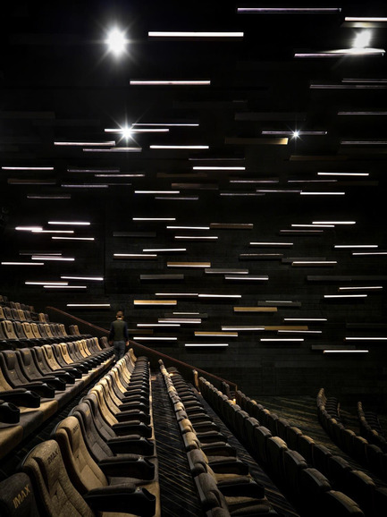
Meteor Cinema by One Plus Partnership
One Plus Partnership wanted to pay tribute to all filmmakers, so they came up with the idea of a meteor shower. Through freezing the precise moment of a meteor shower, the designers want the audience to embrace the magnificent view of this critical moment, as well as the tremendous work behind every filmmaker.
JUDGES’ COMMENT
‘It’s a whole new language of cinema: innovative and confident. It has the confidence to go against the established esthetic of cinema. It’s bold and uncompromising with an integrated approach right the way through to the auditorium.’
One Plus Partnership
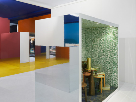
public 03, by i29 interior architects
i29 interior architects designed a pavilion for the Dutch magazine Eigen Huis & Interieur during the annual design fair in RAI Amsterdam.
With an architectural installation i29 strived to make a spatial experience for the visitors that surprises; an environment that should be discovered step by step.
JUDGES’ COMMENT
This is a really beautiful scheme; very magical. Simple forms and clever use of mirrors and colours. It catches the imagination with a very detailed interior within a box, reflecting colours from the surrounding space.’
i29 interior architects
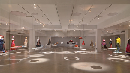
NTCRI Exhibition Nantou by noiz
noiz was commissioned by Taiwan Design Center (TDC) to design an exhibition space for “Original Colors- Natural Colors in Contemporary Design” at National Taiwan Craft Research and Development Institute (NTCRI) in Nantou, Taiwan. The client wanted to upgrade the exhibition design quality in relation to the local exhibitions that usually took place in the museum.
JUDGES’ COMMENT
‘I think it’s an absolutely magical installation which has engendered a sense of fantasy and wonder into the space. Elegantly detailed and beautifully lit.’
noiz
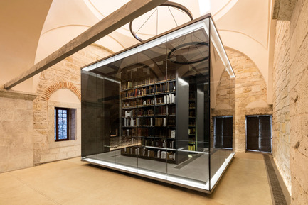
Beyazıt State Library by Tabanlioğlu Architects
Beyazıt State Library is the oldest and the largest library in Istanbul. The Library can be found in Beyazıt Square, the most vibrant space in the old part of the city. The jury were particularly impressed with the sensitive reorganization of the interior.
JUDGES’ COMMENT
‘Fantastic adaptive reuse with contemporary installations highlighting the aesthetics of a heritage framework. Elegant, minimalistic and beautifully realised. The lighting design is truly commendable.’
Tabanlioğlu Architects


