A v2com exclusive
Winner & Shortlisted announcements for WAN Landscape, Civic, Metal in Architecture Awards 2016
World Architecture News Awards (WAN AWARDS)
The world’s largest awards programme in international architecture
Dumfries and Galloway, United Kingdom, 2016-09-21 –
WAN Civic Buildings Award 2016
1. Winner Press Release
Striking, innovative and straightforward, Diller Scofidio Renfro selected as the winner for The Broad
We are excited to announce this year’s winner for the WAN Civic Buildings Award 2016 is Diller Scofidio Renfro for their inspiring and innovative The Broad congratulations!
Diller Scofidio Renfro were selected from a final shortlist of six exceptional projects. The competition showcased an outstanding and diverse range of the finest in public sector architecture from across the globe.
Selected for their experience in this sector our judging panel for 2016 were: Elad Eisenstein, Director Urban Design of Mecanoo architecten, Nicholas Garrison, Partner of FXFOWLE, Patricia Ann Lady Hopkins, Co-founding Partner of Hopkins, Tim Sahuri, Principal of SAHURI + partners architecture inc., Peter Murray, Chairman of New London Architecture and David Naessens, Co-director of Carr Cotter Naessens Architects.
The experienced jury all agreed with absolute conviction that The Broad from Los Angeles, USA, deserved to claim this year’s winning title.
Diller Scofidio Renfro merged a philosophical and functional response to the core missions of the Broad Art Foundation: maximum visibility of their contemporary art collection and optimal transparency of their archives and lending repository, the design which has been dubbed “the veil and the vault,” presents a new, if idiosyncratic, paradigm shift in archive and exhibition design by inverting conventional notions of museum planning and programming.
Located in Grand Avenue Los Angeles, The Broad occupies a key component in the downtown revitalisation plan for which Grand Avenue has emerged as a cultural district.
The Broad’s form merges a dual response to its limited site and its architectural context. Designed in contrast to its architectural leadership of its context on a site that is only 200 feet wide by 200 feet deep and limited to a 70 foot zoning envelope, it dictated the building’s maximum footprint and rectilinear form.
The judges were impressed by the small footprint with Peter sharing: “They use this site very well, the façade is within the urban context and works well. A very simple cut-away of that corner creates a very striking entrance.”
The veil – a light, airy, prefabricated cellular curtain wall façade, designed and developed through a CATIA (BIM) model – cloaks the block-long building while allowing diffused and filtered natural light into the interiors and galleries. Discussion surrounded the innovation of this project and the judges were struck by how the lighting worked within the design. Tim expressed: “The quality and control of light is intriguing and innovative.” Elad also reflected: “Environmentally it’s very clever, it brings in very nicely the light into the building and into the different spaces.”
There was an overall appreciation in the room on the clarity of this project. David echoed this feeling stating: “I like the clarity of the diagram, it’s a proper building. If you went there you would know where you are, you would know where you have to go. I also like the straightforwardness of the lighting and the gallery proposal on the top floor. I think there are very strong diagrammatic things about it.”
Inverting the standard model of “archiving the archive” in unseen back-of-the-house spaces, The Broad places the Foundation’s art collection – more than 2,000 works – in the vault. Rather than relegate the storage to secondary status, the vault plays a key role in shaping the public’s museum experience from entry to exit.
This project has an outstanding design that connects to its surrounding area and strikes into the heart of its community, Elad quite simply expressed: “It’s meaningful for me as in terms of it being a civic building – it has a bit more space inside it for program, so it invites people in. I think it’s at the heart of the city and it creates a really interesting relationship between the outside and the inside.” In summary Peter expressed it quite simply by stating: “They’re a class act aren’t they!”
2. Shortlisted press release
Six sensational projects selected for the WAN Civic Buildings Award 2016
The WAN Civic Buildings Award 2016 recognises and celebrates the finest in public sector architecture. With a variety of high calibre entries from across the globe, this year’s competition did not disappoint. Heading steadily into its eighth year, the WAN Civic Buildings Award not only rewards firms for their architectural and sustainability credentials, but also how projects engage with their local area and integrate within the community.
A longlist of 28 projects were assessed by a panel of experts. The judges used their experience within the sector and considered a number of factors including originality, innovation, form, function sustainability and context to reach their shortlist.
This year’s esteemed judging panel included: Elad Eisenstein, Director Urban Design of Mecanoo architecten, Nicholas Garrison, Partner of FXFOWLE, Patricia Ann Lady Hopkins, Co-founding Partner of Hopkins, Tim Sahuri, Principal of SAHURI + partners architecture inc, Peter Murray, Chairman of New London Architecture and David Naessens, Co-director of Carr Cotter Naessens Architects.
The jury were all impressed with the high calibre of entries and after much deliberation, chose the shortlisted six projects, listed below in no particular order:
Salbura Civic Centre, Vitoria-Gasteiz, Spain by IDOM
The Salburua Civic Centre is located in the Basque City of Vitoria-Gasteiz, in Northern Spain and is a building that combines sporting, cultural and administrative uses to service the neighbourhood of Salburua.
With a limited budget one of the main objectives of the client was to build a centre as a lighthouse for the community. The intention was to attract people inside, and in turn to spread its spirit and activities to the outside community.
The Civic Centre’s height is limited to 14 metres, but it is surrounded by six-story buildings. Thus, in the design process there was no distinction between the façade and roof, which eventually led to giving the building character and visibility in the community. Peter paid compliments on this design: “It’s a nice building and it’s finely detailed. I don’t know much about current building costs but it seems amazingly cheap when you look at the quality that they have managed to get out of it.” David agreed with Peter stating: “I think it’s quite a rigorous and serious building, it’s restrained and not ‘showey-offey’. Everything seems to be well worked out, the sections in particular, with this overlay of different sized spaces, spaces below the ground and spaces above the ground.”
Len Lye Centre, New Plymouth, New Zealand by Pattersons Associates
Referred to as a ‘Journey Through Light’, the Len Lye Centre in New Plymouth, New Zealand is a contemporary art centre situated in the countries oil and gas producing province. The design is influenced by the philosophy of Len Lye who was one of New Zealand’s most notable artists primarily known for his experimental films and kinetic sculpture. Led by a growing interest locally and internationally in his work, the centre was designed adjoining the existing town’s art gallery – a converted theatre. The art facility houses Lye’s archive, display galleries, an education centre and a 62-seat cinema.
The centres shimmering, reflective colonnade façade is manufactured locally using stainless steel and links both Lye’s innovations in kinetics and light as well as the region’s industrial innovation. Visitors to the Len Lye Building experience a kinetic journey through light as they move around and through the building. Patricia deemed it appropriate that the stainless steel was manufactured locally and then followed on to say: “I enjoy the busy-ness and panache of this project. I think that it looks pretty great. I quite enjoy the inside/outside dichotomy, it’s quite interesting, it’s an attractor.” Nicholas also appreciated the design declaring: “This project is compelling and wondrous in ways that so many high-design “object-buildings” are not. It is mesmerising – and somehow irresistible. You want to know more, to get closer and figure it out. It blurs all the lines between art and architecture. Marvellous.”
The Broad, Los Angeles, United States, by Diller Scofidio Renfro
The Broad in L.A. merges a philosophical and functional response to the core missions of the Broad Art Foundation: maximum visibility of their contemporary art collection and optimal transparency of their archives and lending repository. The design, dubbed “the veil and the vault,” presents a new and unique conceptual shift in archive and exhibition design by inverting conventional notions of museum planning and programming.
The Broad plays a key component in the downtown revitalisation plan for Los Angeles, within which Grand Avenue has emerged as a cultural district. Designed in contrast to its to architectural leadership of its context, the site is only 200 feet wide by 200 feet deep and limited to a 70 foot zoning envelope, which dictated the building’s maximum footprint and rectilinear form. The judges were in consensus on both the clarity of function and originality of this project. Tim went on to comment on its simplicity: “The planning is very simple, functional and straightforward, The Broad is inspiring and quite beautiful architecture. The quality and control of light is intriguing and innovative.” Discussing functionality, Elad shared his views with the jury: “It brings quite cleverly, a rather quite complex set of problems inside and puts it very nicely in the back-of-house in a rather normal place in a building, but organises it very elegantly and in a very simple shape.”
The Waterfront Pavilion, Sydney, Australia by FJMT studio
Anchored to the south wharf of Sydney’s Darling Harbour, The Waterfront Pavilion at the Australian National Museum was built to mark the centenary of World War I and commemorate 100 years of service by the Royal Australian Navy. The purpose of this museum pavilion building is to create a transition experience for visitors from the waterfront dock onto the two naval vessels HMAS Vampire and HMAS Onslow.
On a tight budget and built on a narrow existing wharf structure, the design seeks to bring the narratives of war to life and significantly enliven the visitors relationship with the vessels, waterfront and broader museum precinct. The articulated facade of the pavilion compliments the scale, form, colour of the vessels and the broader marine environment.
The majority of jurors were impressed with the scheme and its suitability to the surrounding area. Patricia concurred on the room’s thoughts stating: “I think it’s rather great and it’s suitable. It’s very interesting. I think that it is a really nice, appropriate response to the problem and I like it’s sort of tectonically expressed, it’s very successful. It’s smaller than other entries viewed, but I think it’s great.” Peter added: “It’s a very nice interpretation of a naval iconography on a very tight little site, I think that works. It has a suitable narrative to it and it feels right, sort of naval and slightly war like.”
Public Library – Ronda (Malaga), Malaga, Spain by MMIT ARQUITECTOS
The Public Library Ronda located in Malaga, Spain was constructed on a reduced budget and according to the parameters set as winner of a tender offer in 2012 for a Bus Station and Municipal Library. The municipal library is the first phase of this development.
All the visual recognition features are created by torn visuals from the VIAL DE RONDA or from the potential main walk linked to the rail way. The structure allows for a visual game with two different scales. In the distance, the foreshortened perspective brings the concept of a solid and blind group, allowing to disseminate at a short distance, appreciating the transparency between the ribs. The element of the south façade has been drilled by the graffiti of the Vicente Espinel poems, a local writer.
David nodded to its playfulness but also complimented its rigour stating: “I think that it’s very consistent. It’s a very serious building that’s come from consideration of structure and light in quite a traditional way. You might look at this and think it’s all to do with outside effects, but that sort of rhythm and rigour seems to help inside to make spaces that are broken up into bays. This idea of railed graffiti outside and that it happens again at the stairs on the smaller scale, it shows it’s something that has been really carefully worked out and in detail.” Tim agreed with David’s views stating simply: “It’s striking in its powerful architectural statement of form working very rigorously with function.”
Bibliotheque du Boise, Montreal, Canada by Lemay
Located in Montreal, the idea behind the library’s design was to create new connections and experiences that would reinforce its value to the community and contribute to the creation of a new and attractive centre for cultural activities. In this project, the architecture and landscape blend and compliment one another. The architecture changes shape, unfolds, spreads out and rises up, reducing the boundaries between the built space and the site. This modern building connects the city with the surrounding landscape, and serves as a point of connection that allows users to explore its site.
Discussing the connection between Bibliotheque du Boise within its surrounding context, Nicholas expressed: “Successfully blurring landscape and building, the design consistently and elegantly manages to be both “figure and ground”, object and garden. Its forms and materials bring outside-in, and they are equally compelling in the dead of winter as they are in the full of summer. It is a refreshing commentary on the typological suburban, community library.” Nicholas also felt that the LEED Platinum achievement was also noteworthy.
Elad reflected on the project and how it was reminiscent of a university library, saying: “I mean all of those libraries are coming back to cities. It’s trying to be a place of landscape, very subtle, very close to the ground, all very flat. It’s almost like an old fashioned library. Well done.”
WAN Landscape Award 2016
1. Winner Press Release
Re-thinking urban space in a spectacular way, TAGUS LINEAR PARK by TOPIARIS Lda wins WAN Landscape Award 2016
We are delighted to announce this year’s winner for the WAN Landscape Award 2016 TOPIARIS Lda for their sustainable and inspiring, TAGUS LINEAR PARK – congratulations!
TOPIARIS Lda was selected from a final shortlist of six projects, which showcased the high calibre of entries into this year’s award. This year’s esteemed judging panel were: Andrew Taylor, Director at Patel Taylor, Rob Aspland, Board Director at LDA Design, Nigel Koch, Associate and Leader of London’s Landscape Team at Populous and Tom Armour, Director and Leader of Global Landscape Architecture at Arup. After much debate the panel made the unanimous decision to name TAGUS LINEAR PARK as their winner.
The Tagus Linear Park is an area of 150 000 sq m that was conquered by the surrounding communities of the industrial private sector and was felt as a democratic intervention by those forever deprived of access to the River.
The objective was to rethink urban public space located in a complex, unexpected, almost improbable universe of urban, industrial, agricultural and natural landscape. Aiming to keep the ‘essence of the space’ the team designed a unique greenway, grounded in the landscape’s natural and cultural features, with a multitude of recreational and leisure options, safeguarding the existing natural systems and promoting the ecological regeneration of damaged areas.
Although the standard of projects within the Landscape Award was very high, the entire judging panel agreed that TOPIARIS Lda’s project was a stand-out winner. Nigel highlighted the longevity of the project: “You can see the evolution that’s going to take place, alongside keeping the structure of the industrial element.” Andrew was also immediately drawn to the project, commenting: “A superb project. It has real soul to it, a place I would love to visit.”
The scheme has allowed people of adjacent urban communities, for the first time, to be given recreation and leisure opportunity in direct contact with the riverside, which was until recently blocked by large industrial lots. People of all ages, from different walks of life and cultural backgrounds are now invited to come and enjoy a diverse palette of equipment and activities: from sports, fishing, walking and cycling to environmental education, or simply to get an eyeful of the landscape. This was an aspect that impressed Rob: “I think it’s superb, you could imagine that this transformation is a real benefit to the community.”
The Park combines two different typologies of spaces: A single multifunctional area named ‘PRAIA DOS PESCADORES’ (FISHERMEN’S BEACH), set by the riverside within a former sand deposit, and 6 km of PEDESTRIAN TRAILS associated with dirt roads, waterlines banks (streams and drainage ditches), which converge to Praia dos Pescadores, coming from urban and natural areas. The connection between the ‘beach’ and natural areas is made through a 700m long raised wooden path by which a Bird Observatory built from old pallets can be reached. Tom highlighted the fantastic sustainability aspects of the project: “A key positive for me, is how they have made a lot of the resources, recycling and using simple materials to put the whole thing together. I think as the years go by, it will do even more”
2. Shortlisted press release
Six striking and diverse projects make the WAN Landscape Award 2016 shortlist.
Now in its fourth year, the WAN Landscape Award specialist category was established to celebrate and promote the best in landscape architecture from urban interventions and small developments through to master plans. Landscape design can enrich the experience of a building, improve a public area and enhance the experience of movement between buildings.
A longlist of 27 projects were recently assessed by a panel of experts. The judges used their experience within the sector and considered a number of factors to get to the short list including; originality, innovation, form, function, sustainability and context.
This year’s esteemed judging panel were: Andrew Taylor, Director at Patel Taylor, Rob Aspland, Board Director at LDA Design, Nigel Koch, Associate and Leader of London’s Landscape Team at Populous and Tom Armour, Director and Leader of Global Landscape Architecture at Arup.
The jury were impressed with the high standard of all of this year’s entries and had the difficult task of selecting a shortlist. However, after much discussion, the jury agreed on a shortlist of six, listed below in no particular order:
Rampart Zone ‘s-Hertogenbosch in Hertogenbosch, Netherlands by MTD landscapearchitects / urban designers – Van Roosmalen van Gessel architecten and Studio Leon Their.
In 2008, MTD landschapsarchitecten were commissioned to draw up an image quality plan for the Zuiderpark, the rampart zone and the Casinotuin, in which the main intention was to set out a spatial framework for the developments. To this end, the choice was made for a comprehensive approach in the architecture, the public space and the works of art in the public space.
The first strategic objective of the image quality plan was the restoration of the rampart and for the re-establishment of the excursion along the wall, under the leafy roof of the impressive trees. Whilst the second strategic objective of the image quality plan involves the realisation of an attractive and unambiguous link up from the parking garage through the Casinotuin in the direction of the inner city.
Andrew commented on the complexity of the scheme: “This project is very impressive, the detailing is exquisite. It’s an incredibly controlled project, which has been beautifully carried out, beautifully executed and ultimately brings a good connection to the city.” Rob added: “It appears to be a very subtle intervention, in a very historic context and the precision in design is very impressive.”
The Meadow Garden at Longwood Gardens in Kennett Square, United States by Jonathan Alderson Landscape Architects.
The Meadow Garden at Longwood Gardens is a model for showcasing artfully restored native ecology in the context of one of the world’s premier horticultural display gardens. Juxtaposed with formal and heavily maintained exhibit gardens, the 86-acre wild, temporal and intuitive Meadow Garden re-imagines the “display garden” while preserving the memory of the American Piedmont on former fallow farmland.
Grounded in ecological consciousness, the Meadow Garden’s design was driven by Jens Jensen’s notion that “a garden, to be a work of art, must have the soul of the native landscape in it.” This theme is woven into the site with a complex native plant palette and the interconnected web of migratory birds, important pollinators and native wildlife that these plant communities support.
Public response to the Meadow Garden has exceeded expectations, since opening in June of 2014, attendance has increased from 900,000 to over 1.3 million. This success was considered alongside other elements of the project with Tom saying: “I like all the different techniques the architects have used in terms of maintenance, creating landscape and changing seasons.” It’s clearly successful as well, which is always a positive.” Nigel agreed, adding: “A wholesale enhancement of ecology and visitation and within its context fantastic detailing.”
TAGUS LINEAR PARK in Alverca, Portugal by TOPIARIS Lda
The Tagus Linear Park is an area of 150 000 sq m that was conquered by the surrounding communities of the industrial private sector and was felt as a democratic intervention by those forever deprived of access to the River.
For the first time, people of adjacent urban communities are given recreation and leisure opportunity in direct contact with the riverside, which was until recently blocked by large industrial lots. People of all ages, from different walks of life and cultural backgrounds are now invited to come and enjoy a diverse palette of equipment and activities: from sports, fishing, walking and cycling to environmental education, or simply to get an eyeful of the landscape. The objective was to rethink urban public space located in a complex, unexpected, almost improbable universe of urban, industrial, agricultural and natural landscape.
Andrew was impressed with the renovated space and the benefits to the community, commenting: “A superb project. It has real soul to it, a place I would love to visit.” Most landscape projects will inevitably change over time; this was an aspect which impressed Tom: “I think as the years go by, it will do even more.”
The P.O.R.T. (Publicly Operated Recreation Territory) in Chelsea, United States by Landing Studio
The P.O.R.T. is a shared-use industrial dock, public recreation area, and wildlife habitat landscape built from a former oil tank farm.
The primary challenge of this project was to balance conflicting demands for the urban waterfront to serve the industrial infrastructure of the region while creating recreation and wildlife habitat for the local community. In many cities in the US, the infrastructural capacity of harbours has been dramatically reduced as maritime industries are displaced by increasing property values and gentrification. Such cities have become increasingly dependent on inefficient, costly, and environmentally degrading goods transportation through increased reliance on trucking. The project’s ability to mix industrial operations and urban life was praised among all the judges, Rob went on to elaborate: “I feel it’s a very good model for the programming of space, two seemingly incompatible uses, and industrial and recreational they’ve managed to bring together whilst adding an art dimension, which makes it a very interesting space.”
The design of the P.O.R.T. results from collaboration between an industrial salt company, state waterfront authorities, and local city government to develop a new model of integration between maritime industrial operations and urban life.
Nigel felt the project could act as a blueprint for other designs attempting this difficult task, adding: “A very good example of transformable spaces, bringing together industry and the public. It’s inspiration for how you can deal with the concept.”
Organic Garden in Naucalpan, Estado de Mexico, Mexico by SENOSIAIN ARCHITECTS
The organic garden was designed with the idea of being a recreational and learning space, in which children and adults can create a more spontaneous connection with nature, and discover new and better ways to relate to it. Colourful bridges, slides, mazes and secret passages become the stage where nature plays the leading role.
This is the first phase of Quetzalcoatl’s Park, a medium term project located at the outskirts of Mexico City. The structures of the garden are made of ferrocement and are covered with colourful talavera tile cullet in meander designs; artistic traditions inherited from the Spanish and Prehispanic architecture, characteristic of Mexican plastic arts.
This project grabbed the attention of the entire judging panel. Andrew appreciated the difficulty of the project, commenting: “It’s a good composition, the form is fantastic. This is not an easy thing to do, it works well and kids will want to go there; a real fun project.” The forms are quite incredible; I think it’s a great project.” Rob agreed with Andrew and shared his thoughts: The forms are quite incredible; I think it’s a great project.”
“The Park” in Las Vegas, United States by !melk landscape architecture & urban design.
As the first-ever park on the infamous Las Vegas Strip this project represents an unprecedented addition to the experience of the most visited tourist destination in the world. “The Park” is part of a larger overarching project which is one of the most transformative urban landscape projects in the US today: the Strip’s transformation into a cohesive pedestrian-centric boulevard.
With over 40 million visitors per year property owners are re-thinking the Strip’s urban form by investing in quality pedestrian infrastructure with a coherent design language.
Contributing to the iconicity of “The Park” are the soaring 60-foot tall shade structures. Organized as series of clusters throughout the park these “Desert Blooms,” twice the height of the trees in the park, are artful contributors to the microclimate of the place.
The shade structures are an example of some of the innovative elements found throughout the park, which impressed Nigel: “The detail is fantastic, they have a nice density here to create the shade and allow people to meander from one place to the next. Very nicely done.”
The decision to name this project on the shortlist was unanimous, with Tom adding: “I think it’s really powerful with a strong historical connection, perfect for the city.”
WAN Metal in Architecture Award 2016
1. Winner Press Release
Showcasing the aesthetic and structural realms of metal, Dorte Mandrup Arkitekter and 3deluxe collectively claim title
With the broad spectrum of entrants showcased in this year’s Metal in Architecture Award 2016 we are thrilled to announce we have two winners for 2016: Dorte Mandrup Arkitekter for their exceptional project Salling Tower and 3deluxe for their remarkable Butterfly Pavilion – Noor Island.
Both firms were selected from a final six shortlisted projects. This year’s competition showcased the diversity of metal and its use both structurally and creatively, expressing just how vast the possibilities of using this material are.
This year’s respected jury panel selected for their experience in this sector were: Justin Laskin, Associate Partner at Pollard Thomas Edwards, Martin Henn, Partner at HENN, George Keliris, Director of Structures at BuroHappold Engineering and Bart Reuser, Founding Partner at NEXT Architects.
Collectively, both Dorte Mandrup Arkitekter and 3deluxe were selected by our panel as our champions of metal in architecture.
Salling Tower by Dorte Mandrup Arkitekter
Located on the harbour of Aarhus in Denmark is both a viewing tower and a landmark. It is shaped as a dramatic urban sculpture with a significant architectural expression. The luminous white body of steel is a distinctive focal point and meeting place. Visitors are led on a course full of experiences that begin at the quayside and go to the upper platform 7.5 metres above the quay level. The route through the tower leads under an inclined surface and up to the first viewing plateau that hovers above the water. From here, the visitor is led upwards by a broad staircase which serves a lookout to panoramic views of the harbour and bay. Finally, the covered upper plateau provides a 360 degree overlook of the city and the harbour.
Relating to the experience of the structure Justin aired: “It has a really nice aesthetic to it. It is really a sort of a folly in the truer sense in that it’s not a practical structure and that it’s basically there to be itself and to demonstrate actually what metal can do. It’s treating skin and structure all as one thing. It’s reminiscent of sails and shipping and cranes and all of those things.” Martins comments coincided with Justin’s: “The concise form impresses with a bold cantilever on the edge of the dock and its subtle reminiscence of naval architecture. The prefabricated, single material structure appears very stringent and playful at the same time inviting people to enjoy the views over the harbour.”
The tower weights around 85 tonnes and is made entirely of welded steel plates. The tower was assembled as one piece and mounted on the waterfront by two cranes that navigated the structure onto the small foundation where it was bolted in place. To allow the construction to balance on the small footprint while considering factors such as weight and movement from visitors, coupled with wind loads proved a significant challenge. The peek holes in the white painted steel plate construction promote not only the feeling of being at sea, but also reduce wind loads and constitute 20 percent in material reduction. Justin summarised his views with: “I think that this is one of the more interesting uses of metal in itself because of the way that its use blurs that line between skin and structure, and delicate balancing and use of material, to actually do something of what it’s good at.”
Butterfly Pavilion – Noor Island by 3deluxe
Noor Island is located in the middle of the capital of the Sharjah, Arab Emirates where design studio 3deluxe is currently designing a 2.5 ha transmedia Landscape Park, interwoven with a collective of several themed pavilions and buildings. Being the first architectural structure to shape the island’s appearance, the Butterfly Pavilion with its ornamental shading roof, houses more than 500 butterflies in a unique biosphere. The shape and design of the pavilion’s biomorphic outer shell are the product of an exploration of parametric design strategies in dialog with traditional Arabian ornamentation. The highly complex freeform roof is composed of a load-bearing 3D frame with over 4,000 golden aluminium leaves of varying sizes. Impressed by the complexity of this design, Justin commented: “In terms of metal this is really interesting. For a metal award, it’s very clever. When you get down to the interlocking’s of the fixings and filigree of these pieces it’s amazing.“
The roof as a whole remains strikingly delicate, with only a 200mm thick support structure required. The entire structure rests on only 9 points and three pillars that like a tree trunk taper upwards while branching outwards. The Butterfly Pavilion’s shading roof is not only designed to be formally defining; it also serves to regulate the climate without putting a visual emphasis on the fact. Bart praised both the imagery and functionality of this project by saying: “Strong, innovative, complex and tempting image, especially the shading quality of a space frame is extraordinary, nice use of structural, aesthetic and functional design.” In addition to the shading the roof provides, the geometry actively supports the chimney effect, which funnels hot air over the roof and façade, while the water pools act as humidifiers, cooling inflowing air. Beneath the Butterfly Pavilion’s shady golden roof is a glass cube: the polygonal pavilion is an artificial eco-system, and its rainforest biotope – populated with countless butterflies – is housed inside a sealed climate skin. George complimented the overall structure stating: “A delicate, sweeping form echoes the characteristics of the inhabitants of this pavilion. The quality of the overall shape carries through to the detailing and finish of its elements making this a worthy winner.”
WAN AWARDS would like to congratulate both of our respectable winners, Dorte Mandrup Arkitekter and 3deluxe for their incredible winning projects. We would also like to thank our fantastic jury members for their time and experience and to all those who entered into the Metal in Architecture Award 2016.
2. Shortlisted press release
Six outstanding and diverse projects showcase the diversity of metal
Moving into its third year, the WAN Metal in Architecture Award 2016 recognises the increasingly high standards that are being achieved within metal design and construction. This Award celebrates the use of this material across the whole spectrum, from Aluminium, Steel, Lead, Tin, Zinc, Copper and Nickel.
A long list of 31 projects were evaluated by a panel of industry experts who used their experience within this sector. To reach their verdict, factors such as originality, innovation, form, function, sustainability and context were considered.
Representing this sector we were honoured to have on this year’s panel: Justin Laskin, Associate Partner at Pollard Thomas Edwards, Martin Henn, Partner at HENN, George Keliris, Director of Structures at BuroHappold Engineering and Bart Reuser, Founding Partner at NEXT Architects.
The jury acknowledged the diversity of this year’s entrants and selected a shortlist of six projects, which are as follows in no particular order:
The « FORUM » Associative by MANUELLE GAUTRAND ARCHITECTURE
The FORUM Associative is an events and sports facility located in Saint-Louis, France. Designed like a puzzle, each space fits into the continuity of the next one, allowing a fluid circulation and rapid flow between the functions, where no corridor or galleries are needed. The main challenge of this project was to ensure that those spaces had the possibility to communicate in a more or less direct way, according to the program of the moment.
The spaces all fit together uniquely due to all being covered with the same principles of forms, materials and openings. The roof volume is systematically made up of two slopes, inspired by the design of the roofs in the area, Martin applauded the simplicity of this stating: “The combination of metal and a pitched roof building is surprising and interesting. The cell-like aggregation and the reduced appearance create a highly abstract impression.” The project is made up of several distinct volumes, linked up to one another in a way the smaller volumes are placed at the edge of the individual houses, and the more imposing ones placed at the centre.
To create a unified project, all the claddings (facades and roofs) are treated with the same finishing material; an expanded metal (©Métal Déployé) mounted on big frames, with a very specific colour inspired from natural copper. Bart complimented the project saying: “Basic use of metal as a single material for the whole building makes a strong and lasting character.” Justin also approved of the scheme: “It is an interesting and playful use of metal. They’ve taken it right the way through and used it as decorative motif.”
Butterfly Pavilion – Noor Island by 3deluxe
On Noor Island, a lagoon island in the middle of the capital of the Arab Emirate Sharjah, design studio 3deluxe is currently designing a 2.5 ha transmedia Landscape Park, interwoven with an ensemble of several themed pavilions and buildings.
The most striking building on Noor Island is Butterfly Pavilion, whose ornamental shading roof characterizes the island. It houses more than 500 butterflies in a unique biosphere and offers visitors numerous opportunities for both contemplation and recreation.
The entire roof structure was prefabricated and then assembled on site. The individual roof elements are fastened by means of intelligent node connectors that are able to combine in a single connector all the different connection angles of the inter-related roof elements. The highly complex freeform roof is composed of a load-bearing 3D frame with over 4,000 golden aluminium leaves of varying sizes. The roof as a whole remains strikingly delicate, with only a 200mm thick support structure required. The entire structure rests on only 9 points and three pillars that like a tree trunk taper upwards while branching outwards. Impressed by the craftsmanship and the impact of this project Bart expressed: “Strong, innovative, complex and tempting image, especially the shading quality of a space frame is extraordinary, nice use of structural, aesthetic and functional design.”
The design of the Butterfly Pavilion, is realises its design principle of multi-layered atmospheres: in material and mood layers, natural and artificial levels which blend into a visually and emotionally condensed overall picture.
Colorado Outward Bound School Micro Cabins by University of Colorado Denver
ColoradoBuildingWorkshop
Located on a steep hillside in a pine forest, the Micro-Cabins in Leadville, Colorado, were designed as micro dormitories for the Colorado Outward Bound School. The cabins rest on the landscape, elevated above the winter snow pack on steel columns. The client brief called for 21 cabins, seven senior staff insulated cabins for year-round use and 14 un-insulated cabins to meet the housing needs during peak season.
In 2015, a group of 28 students undertook the 14 un-insulated cabins. They were conceived as two simple elements: a “box” and a “frame.” The frame, consisting of three structural steel bays, handles both the gravity and lateral loads of the building.
No two cabins are alike, and the students explored the versatility of metal as a material covering all areas. Justin conveyed their use of the material sharing: “It’s really innovative in its use of metal and it’s beautiful. It’s a very clever way of using steel. They’ve used it for exposed structure, they’ve used it for counter tops, for different lighting, they use different cladding in each way, sort of taking the material and using it specifically in how it could best suit that particular use. It’s not just exposing structure, but using it as a decorative material, a structural material, a pile, a beam. It is a really elegant simple thing and I like it.”
Salling Tower by Dorte Mandrup Arkitekter
The viewing tower and landmark on the harbour of Aarhus Ø, Denmark, Salling Tower is shaped as a dramatic urban sculpture with a significant architectural expression. The white body of steel is a luminous and distinctive focal point and meeting place. The route through the tower leads under an inclined surface and up to the first viewing plateau that hovers above the water. From here, the visitor is led upwards by a broad staircase which serves a lookout to panoramic views of the harbour and bay. The upper plateau serves 360 degree views of both the city and harbour.
The tower was assembled as one piece and mounted on the waterfront by two cranes that navigated the heavy structure onto the small foundation where it was bolted in place. To allow the construction to balance on the small footprint while considering factors such as weight and movement from visitors coupled with wind loads proved a significant challenge only able to be addressed through close collaboration with the engineers from Søren Jensen A/S. Peek holes in the massive white painted steel plate construction promote the feeling of being at sea. The peek holes reduce wind loads and constitute 20 percent in material reduction. Justin noted: “The lighting is actually really dramatic, it’s like some sort of piece of installation art and I do like the images of people fishing from it and people just sitting out in the sun.” Bart also acknowledged: “Great Folly. It uses all qualities of metal to create an experience.” Martin commented on why he thought this worked: “The prefabricated, single material structure appears very stringent and playful at the same time inviting people to enjoy the views over the harbour.”
Castle Downs Park Pavilion by gh3
The Castle Downs Park Pavilion located in Edmonton Alberta, Canada unifies a wide range of outdoor recreational facilities within a suburban park, and helps instil them with a sense of place. As an organizing device along an east-west axis, the low-slung linear pavilion responds to the prairie landscape and gives definition to a vast, flat site. Faceting and inflection characterize the form of the punctuated bar – a mirrored pavilion that offers broken and distorted reflections of its immediate environment. As an object in the landscape, the pavilion has an important function in connecting the various sports fields directly to its north and south.
To amplify the energy of the park, mirrored stainless-steel panels skin the building. Impact friendly, the panels offer a combination of durability, renewability and playfulness. The accordion like exterior walls are held in tension by a horizontal roof plane. The shallow 150-millimetre depth of the facia is achieved through a combination of an inverted roofing system over the significant cantilever of the portals and a conventional roofing system for the remainder. In plan, they are arranged in a zigzag configuration creating fragmented and reflected views of the surrounding park, its users, along with the days and seasons. This left an impression with Bart commenting: “Diverse use of material, nice, exceptional character, blends with surroundings.”
Imagine Studio at The Trees by Studio Lotus+GPL Design Studio
Located in Mumbai, India the Imagine Studio is a response to the heritage of one of India’s biggest industrial houses ‘Godrej’, a family owned business that started making locks in 1897.
Programmatically the buildings currently adapt into a marketing office, sample flats, meeting spaces, a small café, as well as several outdoor spaces to market upcoming residential and commercial properties. A tall chimney evocative of bygone industrial aesthetic, stands as a striking memorial. The old louvers of the primary plant, now Imagine Studio, were recovered and repurposed in Corten steel and perforated with patterns simulating the filtering of light from the leafy canopy of rain trees at the site. The timeless architectural form was derived from the current industrial shed and the materiality of Corten Steel, Brass, Concrete and Timber purposefully build upon the narrative of the project. George admired the use of this site stating: “A thoughtful series of interventions in this industrial heritage site. Various metal interventions repurpose existing buildings with the aim of catalysing future development of the area.”
Sustainability was a key principle for this adaptive reuse project with the landscape design strategically repurposing the heritage environment in a more urban, community-centric setting. Amalgamating industrial scrap and integrating them with the plants, it uses them as a story telling device. Justin was charmed by the re-use of this project and the story it told throughout: “They use perforation of metal in so many different ways here, in the use of this sort of glowing thing that you see the trees through here, then as louvers that light filters through from another side, then you’ve got your metal here where they’ve cut pieces out of it to make it as a place that you can occupy, they use it as sort of an art installation, down to even the cuts out of as something that’s then used within the ground as a bench, even down to the markings down in the ground, it’s very thoughtfully detailed.”
The 2016 WAN AWARDS calendar is available for download here.
– 30 –
- WAN AWARDS
- Francesca Maw
- [email protected]
- 01273201109
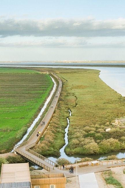
TAGUS LINEAR PARK by TOPIARIS Lda © João Morgado
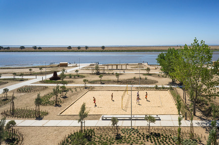
TAGUS LINEAR PARK by TOPIARIS Lda © João Morgado
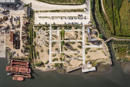
TAGUS LINEAR PARK by TOPIARIS Lda © João Morgado
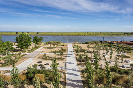
TAGUS LINEAR PARK by TOPIARIS Lda © João Morgado
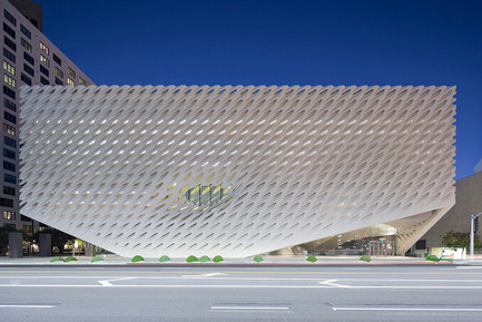
The Broad by Diller Scofidio Renfro © Iwan Baan
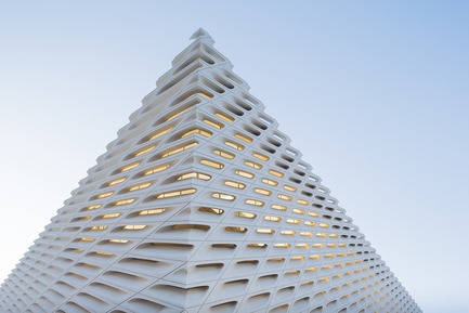
The Broad by Diller Scofidio Renfro © Iwan Baan
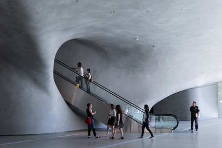
The Broad by Diller Scofidio Renfro © Iwan Baan
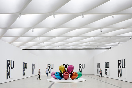
The Broad by Diller Scofidio Renfro © Iwan Baan
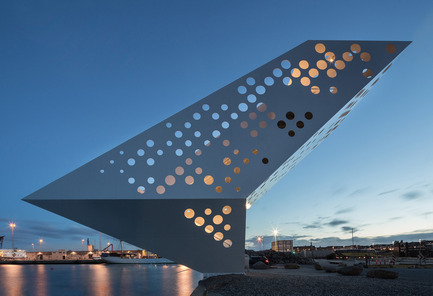
Salling Tower by Dorte Mandrup Arkitekter © Quintin Lake
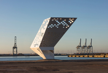
Salling Tower by Dorte Mandrup Arkitekter © Quintin Lake
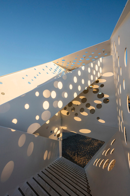
Salling Tower by Dorte Mandrup Arkitekter © Quintin Lake
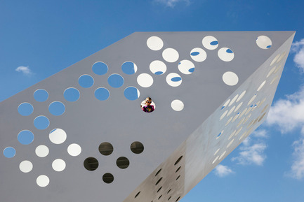
Salling Tower by Dorte Mandrup Arkitekter © Quintin Lake

Butterfly Pavilion – Noor Island by by 3deluxe. 2015 Photography: Sascha Jahnke
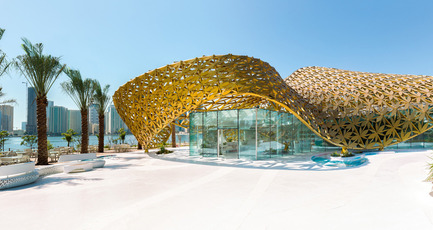
Butterfly Pavilion – Noor Island by 3deluxe. 2015 Photography: Torsten Seidel
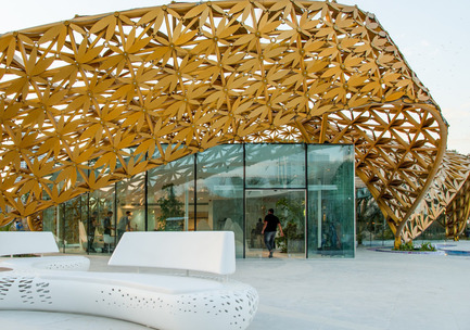
Butterfly Pavilion – Noor Island by 3deluxe. 2015 Photography: Sascha Jahnke


