WIN Awards – Retail & Workspace Interiors Shortlist Announced


Flag black

Press kit - Press release - WIN Awards - Retail & Workspace Interiors Shortlist Announced - World Interiors News


A v2com exclusive

WIN Awards – Retail & Workspace Interiors Shortlist Announced

London, United Kingdom

World Interiors News


Brighton, United Kingdom, 2016-06-16 –

Following both enjoyable and stimulating jury sessions in London, WIN is delighted to announce the shortlist for the Workspace Interiors and Retail Interiors categories, the results of which are published on our website WorldInteriorsNews.com

The judging panel for the Workspace category was leading industry experts:

  • Jacob Loftus Ā (JL)– Head of UK Investment, Resolution Property
  • Angela Jeng (AJ)Ā ā€“ Project Director, John Robertson Architects
  • Fiona Livingston (FL) ā€“ Co-Founder Studiofibre
  • Sean Hatcher (SH)Ā ā€“ Board Director, MCM Architecture
  • Mijail Gutierrez (MG)Ā ā€“ Design Director, Perkins + Will.

The judging Panel for the Retail Category was leading industry experts;

  • Carmel Allen Ā (CA)ā€“ Creative Director, LINLEY
  • Heike Bergamini (HB) – Senior Design Manager, SELFRIDGES & CO
  • Simon Kincaid (SK)ā€“ Project Director, Conran & Partners
  • Matthew Moore (MM)Ā ā€“ Head of Creative, Jigsaw Group
  • Jon Tollit (JT)Ā ā€“ Principal, Gensler.

Congratulations to all those who have been shortlisted, we received outstanding entries across both categories making the judges’ decision ever more difficult.

The winners for each category be announced at an event at the end of the year, further details will be announced in due course.Ā 

To find out more information about the World Interiors News Award, please visit www.worldinteriorsnews.com or Ā 


– 30 –
Media contact

  • World Interiors News
  • Steven Penney – Awards Manager
  • [email protected]
  • +44 (0)1273 201 117

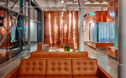
Press kit | 1124-08 - Press release | WIN Awards - Retail & Workspace Interiors Shortlist Announced - World Interiors News - Commercial Interior Design - WIN Awards 2016 - Workspace Interiors Greater Than 10,000 SQM Category: Octapharma by White Arkitekter AB (Sweden)     <br><br> The Swedish pharmaceutical manufacturer Octapharma is the only major industry left in the inner city of Stockholm. A few years ago the company outgrew itā€™s old premises and acquired the nearby Stora Bryggeriet (large brewery) and commissioned White to transform the space.    <br><br> ā€˜I like this project because of the romantic story and the understanding of the historical aspects. I thought it was calm, I thought it was controlled and in some aspects very clever, especially the elements of detail going right the way down to the etched signage on the copper pavilions.ā€™ SH  - Photo credit: White Arkitekter AB

WIN Awards 2016 – Workspace Interiors Greater Than 10,000 SQM Category: Octapharma by White Arkitekter AB (Sweden) Ā 

The Swedish pharmaceutical manufacturer Octapharma is the only major industry left in the inner city of Stockholm. A few years ago the company outgrew itā€™s old premises and acquired the nearby Stora Bryggeriet (large brewery) and commissioned White to transform the space. Ā 

ā€˜I like this project because of the romantic story and the understanding of the historical aspects. I thought it was calm, I thought it was controlled and in some aspects very clever, especially the elements of detail going right the way down to the etched signage on the copper pavilions.ā€™ SH

Photo credit:
White Arkitekter AB

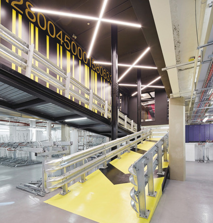
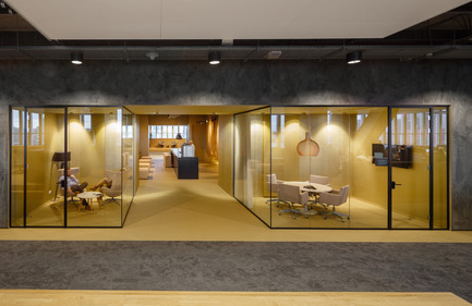
Press kit | 1124-08 - Press release | WIN Awards - Retail & Workspace Interiors Shortlist Announced - World Interiors News - Commercial Interior Design -  WIN Awards 2016 - Workspace Interiors Greater Than 10,000 SQM Category: Alphabeta by Studio RHE (United Kingdom) <br><br>The brief for Alphabeta was to take the existing Triton Court - empty, dated and difficult to use - and transform it into a contemporary space that could appeal to a new, more fluid and adept workforce. Located on the intersection between Shoreditch and the City, Studio RHEā€™s design objective was to reflect the merging creative, tech and financial sector industries shaping Londonā€™s new economy. <br><br>ā€˜I love the vibe of the building; it feels very ā€˜of our timeā€™. It is both consistent and relevant as an interior project.ā€™ MG<br>  - Photo credit: Studio RHE

WIN Awards 2016 – Workspace Interiors Greater Than 10,000 SQM Category: Alphabeta by Studio RHE (United Kingdom)Ā 

The brief for Alphabeta was to take the existing Triton Court – empty, dated and difficult to use – and transform it into a contemporary space that could appeal to a new, more fluid and adept workforce. Located on the intersection between Shoreditch and the City, Studio RHEā€™s design objective was to reflect the merging creative, tech and financial sector industries shaping Londonā€™s new economy.Ā 

ā€˜I love the vibe of the building; it feels very ā€˜of our timeā€™. It is both consistent and relevant as an interior project.ā€™ MG

Photo credit:
Studio RHE

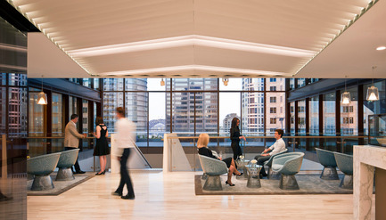
Press kit | 1124-08 - Press release | WIN Awards - Retail & Workspace Interiors Shortlist Announced - World Interiors News - Commercial Interior Design -  WIN Awards 2016 - Workspace Interiors Greater Than 10,000 SQM Category: Corrs Chambers Westgarth by Bates Smart (Australia) <br><br>An integral part of independent law firm Corrs Chambers Westgarthā€™s strategy was to transform each of its offices into inspirational and innovative workspaces. Their vision was to create open, flexible and collaborative working environments to foster knowledge sharing and mentoring, innovation, client connectivity, mobility and use of leading technology.  <br><br>ā€˜This met the brief extremely well, a grown up and confident project using lovely materials.ā€™ JL <br><br>ā€˜An elegant solution using great brand consistency.ā€™ MG  - Photo credit: Bates Smart

WIN Awards 2016 – Workspace Interiors Greater Than 10,000 SQM Category: Corrs Chambers Westgarth by Bates Smart (Australia)Ā 

An integral part of independent law firm Corrs Chambers Westgarthā€™s strategy was to transform each of its offices into inspirational and innovative workspaces. Their vision was to create open, flexible and collaborative working environments to foster knowledge sharing and mentoring, innovation, client connectivity, mobility and use of leading technology. Ā 

ā€˜This met the brief extremely well, a grown up and confident project using lovely materials.ā€™ JLĀ 

ā€˜An elegant solution using great brand consistency.ā€™ MG

Photo credit:
Bates Smart

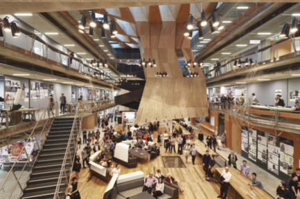
Press kit | 1124-08 - Press release | WIN Awards - Retail & Workspace Interiors Shortlist Announced - World Interiors News - Commercial Interior Design - WIN Awards 2016 - Workspace Interiors Greater Than 10,000 SQM Category: MSD by NADAAA (in collaboration with John Wardle Architects) (USA)<br><br>MSD is a global healthcare leader based in Australia. Their new building embraces the notion of working that favours the acts of doing, making and problem solving in a critical yet collaborative environment. The building incorporates two theatres, a workshop, library, two exhibitions spaces, cafĆ©, a series of studios and associated academic and professional workspaces with the studio hall.<br><br>ā€˜A very strong scheme; a really holistic and dynamic village of creativity.ā€™ SH <br><br>ā€˜Beautifully presented, conceptually very strong.ā€™ MG   <br><br>ā€˜This project stood out for me for the interesting geometrics of the design which has stamped an exciting narrative on the building.ā€™ FL  <br><br>ā€˜I really enjoyed the story and the materiality of the project. I think the Studio Hall is very strong and dynamic.ā€™ AJ - Photo credit: NADAAA (in collaboration with John Wardle Architects)
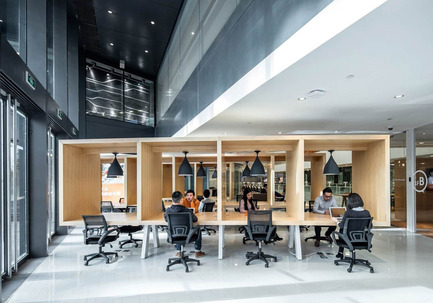
WIN Awards 2016 – Workspace Interiors Greater Than 10,000 SQM Category: Alphabeta by Studio RHE (United Kingdom)Ā 

The brief for Alphabeta was to take the existing Triton Court – empty, dated and difficult to use – and transform it into a contemporary space that could appeal to a new, more fluid and adept workforce. Located on the intersection between Shoreditch and the City, Studio RHEā€™s design objective was to reflect the merging creative, tech and financial sector industries shaping Londonā€™s new economy.Ā 

ā€˜I love the vibe of the building; it feels very ā€˜of our timeā€™. It is both consistent and relevant as an interior project.ā€™ MG

Photo credit:
NADAAA (in collaboration with John Wardle Architects)

Press kit | 1124-08 - Press release | WIN Awards - Retail & Workspace Interiors Shortlist Announced - World Interiors News - Commercial Interior Design - WIN Awards 2016 - Workspace Interiors Greater Than 10,000 SQM Category: SOHO 3Q Guanghualu by AIM Architecture International Ltd (China)<br><br>The SOHO 3Q co-working space is 20,000 sq. m with 3,500 desks ā€“ the largest of its kind in China. AIM created large activity elements and social spaces that served as nuclei for gathering, congregating and interacting. <br><br>ā€˜To connect that many people running their own companies into a collaborate community is pretty challenging given the scale. The concept of treating the whole hub like an internal 3 storey shopping centre with a park in the middle thereby creating excellent connectivity across the space, is a wonderful vision for how you can create a collaborative and vibrant community.ā€™ JL - Photo credit: AIM Architecture International Ltd

WIN Awards 2016 – Workspace Interiors Greater Than 10,000 SQM Category: SOHO 3Q Guanghualu by AIM Architecture International Ltd (China)

The SOHO 3Q co-working space is 20,000 sq. m with 3,500 desks ā€“ the largest of its kind in China. AIM created large activity elements and social spaces that served as nuclei for gathering, congregating and interacting.Ā 

ā€˜To connect that many people running their own companies into a collaborate community is pretty challenging given the scale. The concept of treating the whole hub like an internal 3 storey shopping centre with a park in the middle thereby creating excellent connectivity across the space, is a wonderful vision for how you can create a collaborative and vibrant community.ā€™ JL

Photo credit:
AIM Architecture International Ltd

Press kit | 1124-08 - Press release | WIN Awards - Retail & Workspace Interiors Shortlist Announced - World Interiors News - Commercial Interior Design - WIN Awards 2016 - Workspace Interiors Less Than 10,000 SQM Category: 67/2 Office by escapefromsofa (Turkey)<br><br>This multi-disciplinary 140 sq. m design office is located on the ground floor of a historical Greek apartment in Istanbulā€™s design district area, Galata. <br><br>During the restoration, the frescos on the ceilings have been revived through a delicate workmanship. The walls in the main hallway, which is the entry and the center of the space have been peeled and the old Constantinople stamped bricks have been brought on the scene. <br><br>ā€˜What I liked about this was actually its warmth. It has a certain charm about it,and a hint of fun as well. As this is their main office, I think a twist of fun suggests that they donā€™t take themselves too seriously which is good; it shows a certain confidence about who they are. I like the mix of traditional and modern, together with some really quite delicate touches in terms of the artwork and features. Overall, although itā€™s an office space, it has a warmth that is more akin to an apartment, certainly somewhere that I could imagine myself working.ā€™ SH<br> - Photo credit: EscapeFromSofa

WIN Awards 2016 – Workspace Interiors Less Than 10,000 SQM Category: 67/2 Office byĀ escapefromsofa (Turkey)

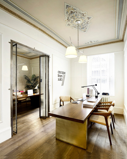
This multi-disciplinary 140 sq. m design office is located on the ground floor of a historical Greek apartment in Istanbulā€™s design district area, Galata.Ā 

During the restoration, the frescos on the ceilings have been revived through a delicate workmanship. The walls in the main hallway, which is the entry and the center of the space have been peeled and the old Constantinople stamped bricks have been brought on the scene.Ā 

ā€˜What I liked about this was actually its warmth. It has a certain charm about it,and a hint of fun as well. As this is their main office, I think a twist of fun suggests that they donā€™t take themselves too seriously which is good; it shows a certain confidence about who they are. I like the mix of traditional and modern, together with some really quite delicate touches in terms of the artwork and features. Overall, although itā€™s an office space, it has a warmth that is more akin to an apartment, certainly somewhere that I could imagine myself working.ā€™ SH

Photo credit:
EscapeFromSofa

Press kit | 1124-08 - Press release | WIN Awards - Retail & Workspace Interiors Shortlist Announced - World Interiors News - Commercial Interior Design - WIN Awards 2016 - Workspace Interiors Less Than 10,000 SQM Category: EstĆ©e Lauder Companies HQ by MCM Architecture (United Kingdom)<br><br>The relocation of The EstĆ©e Lauder Companies UK & Ireland to One Fitzroy is the first time globally, that the business has brought together all of its brands and training facilities under one roof. <br><br>The vision for the new headquarters centred around the themes of family, home and community to support collaboration, agility, creativity and innovation. It was crucial that this was reflected in the design of One Fitzroy. <br><br>ā€˜Itā€™s a very luxurious design and great headquarters office. It really captures the EstĆ©e Lauder brandā€™ AJ <br><br>ā€˜A beautiful translation of the brand as an experience with a high end retail quality to the space, you literally live the brand as you walk through it. Lovely detailing, and generally a very strong design ethos throughout.ā€™ MG<br> - Photo credit: MCM Architecture

WIN Awards 2016 – Workspace Interiors Less Than 10,000 SQM Category: EstĆ©e Lauder Companies HQ by MCM Architecture (United Kingdom)

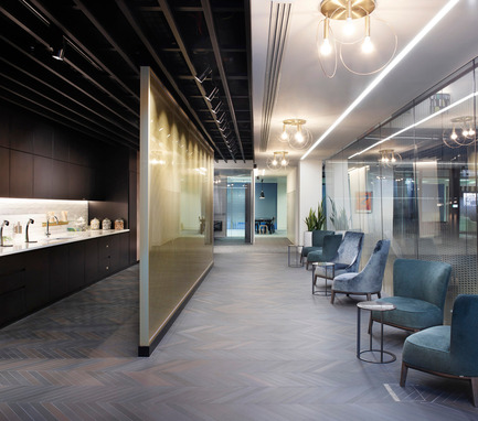
The relocation of The EstĆ©e Lauder Companies UK & Ireland to One Fitzroy is the first time globally, that the business has brought together all of its brands and training facilities under one roof.Ā 

The vision for the new headquarters centred around the themes of family, home and community to support collaboration, agility, creativity and innovation. It was crucial that this was reflected in the design of One Fitzroy.Ā 

ā€˜Itā€™s a very luxurious design and great headquarters office. It really captures the EstĆ©e Lauder brandā€™ AJĀ 

ā€˜A beautiful translation of the brand as an experience with a high end retail quality to the space, you literally live the brand as you walk through it. Lovely detailing, and generally a very strong design ethos throughout.ā€™ MG

Photo credit:
MCM Architecture

Press kit | 1124-08 - Press release | WIN Awards - Retail & Workspace Interiors Shortlist Announced - World Interiors News - Commercial Interior Design - WIN Awards 2016 - Workspace Interiors Less Than 10,000 SQM Category: HNK Utrecht CS by SKEPP design+build (Netherlands)<br><br>HNK Centraal Station is an office that also showcases highlights of Utrecht. Based on the location of different points of interest within the city, different zones were created that informed the design. These zones are Centraal Station, the Dom, Rietvelds Schroderhuis, Rotsoord and HNK Utrecht (I). Walking through the entrance, various colours and styles indicate where the different areas are located.                                                                             <br><br>ā€˜I like the sustainable story behind this project, the use of second hand materials which is partly for budget reasons, but works well nonetheless. I like the cultural piece, where they have integrated the story of the City, and the way they have used artists and writers in the design so itā€™s a showcase for the City.ā€™ MG<br> - Photo credit: SKEPP design+build 

WIN Awards 2016 – Workspace Interiors Less Than 10,000 SQM Category: HNK Utrecht CS by SKEPP design+build (Netherlands)

HNK Centraal Station is an office that also showcases highlights of Utrecht. Based on the location of different points of interest within the city, different zones were created that informed the design. These zones are Centraal Station, the Dom, Rietvelds Schroderhuis, Rotsoord and HNK Utrecht (I). Walking through the entrance, various colours and styles indicate where the different areas are located.Ā Ā Ā Ā Ā Ā Ā Ā Ā Ā Ā Ā Ā Ā Ā Ā Ā Ā Ā Ā Ā Ā Ā Ā Ā Ā Ā Ā Ā Ā Ā Ā Ā Ā Ā Ā Ā Ā Ā Ā Ā Ā Ā Ā Ā Ā Ā Ā Ā Ā Ā Ā Ā Ā Ā Ā Ā Ā Ā Ā Ā Ā Ā Ā Ā Ā Ā Ā Ā Ā Ā Ā Ā Ā Ā Ā 

ā€˜I like the sustainable story behind this project, the use of second hand materials which is partly for budget reasons, but works well nonetheless. I like the cultural piece, where they have integrated the story of the City, and the way they have used artists and writers in the design so itā€™s a showcase for the City.ā€™ MG

Photo credit:
SKEPP design+buildĀ 

Press kit | 1124-08 - Press release | WIN Awards - Retail & Workspace Interiors Shortlist Announced - World Interiors News - Commercial Interior Design - WIN Awards 2016 - Workspace Interiors Less Than 10,000 SQM Category: Woods Bagot Melbourne Studio by Woods Bagot (Australia) <br><br>To avoid their architects and interior designers pulling in different directions Woods Bagot embarked on a consultative workplace strategy to gather feedback from all staff ranging from staff in IT, Architecture/Interiors, finance, marketing and the Principals of the practice. The feedback was an overarching desire to work collaboratively but to also enable a celebration of social gatherings and the studious nature of the collective. <br><br>ā€˜What an exciting brief to have! But also an extremely challenging one. I think they have created an architectural space, which is really pretty exceptional, and I think some of the reasons behind that is because it is very honest in terms of its use. There are some great focus spaces, which will bring the studio together. Thereā€™s also an honesty about materials, theyā€™re not trying too hard which, I think will make it more timeless, not too many gimmicks which one quite often sees. Itā€™s just a simple and strong concept with amazing use of light and dark and shade, and Iā€™m sure the people who work there along with any consultants or clients who visit the space will believe it to be a really exceptional space.ā€™ SH<br> - Photo credit: Woods Bagot

WIN Awards 2016 – Workspace Interiors Less Than 10,000 SQM Category:Ā Woods Bagot Melbourne Studio by Woods Bagot (Australia)Ā 

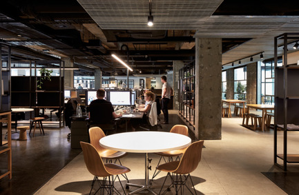
To avoid their architects and interior designers pulling in different directions Woods Bagot embarked on a consultative workplace strategy to gather feedback from all staff ranging from staff in IT, Architecture/Interiors, finance, marketing and the Principals of the practice. The feedback was an overarching desire to work collaboratively but to also enable a celebration of social gatherings and the studious nature of the collective.Ā 

ā€˜What an exciting brief to have! But also an extremely challenging one. I think they have created an architectural space, which is really pretty exceptional, and I think some of the reasons behind that is because it is very honest in terms of its use. There are some great focus spaces, which will bring the studio together. Thereā€™s also an honesty about materials, theyā€™re not trying too hard which, I think will make it more timeless, not too many gimmicks which one quite often sees. Itā€™s just a simple and strong concept with amazing use of light and dark and shade, and Iā€™m sure the people who work there along with any consultants or clients who visit the space will believe it to be a really exceptional space.ā€™ SH

Photo credit:
Woods Bagot

Press kit | 1124-08 - Press release | WIN Awards - Retail & Workspace Interiors Shortlist Announced - World Interiors News - Commercial Interior Design -  WIN Awards 2016 - Workspace Interiors Less Than 10,000 SQM Category: Nidera Office in ā€˜De Rotterdamā€™ by Fokkema & Partners Architecten (Netherlands)<br><br>At the 5th floor of the new skyscraper ā€˜De Rotterdamā€™, Fokkema & Partners designed a new office for an international trade company. The interior celebrates the scale and character of the building, but above all it identifies with the characteristics of the company, where ā€˜boldā€™ and ā€˜corporateā€™ meet. <br><br>ā€˜I think I like this because I would like to work there. Itā€™s a very considered scheme, very calm, very controlled. I like the way that the sofa spaces are almost places that you could choose to go to. Thereā€™s a very interesting spectrum of workspaces, and the use of materials, which they have beautifully described, is a real range and breadth of hard and soft, as is the lighting. They have considered everything right down to the minutiae, so even the toilets have been considered. A really exceptional scheme.ā€™ SH<br>  - Photo credit: Fokkema & Partners Architecten

WIN Awards 2016 – Workspace Interiors Less Than 10,000 SQM Category: Nidera Office in ā€˜De Rotterdamā€™ by Fokkema & Partners Architecten (Netherlands)

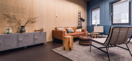
At the 5th floor of the new skyscraper ā€˜De Rotterdamā€™, Fokkema & Partners designed a new office for an international trade company. The interior celebrates the scale and character of the building, but above all it identifies with the characteristics of the company, where ā€˜boldā€™ and ā€˜corporateā€™ meet.Ā 

ā€˜I think I like this because I would like to work there. Itā€™s a very considered scheme, very calm, very controlled. I like the way that the sofa spaces are almost places that you could choose to go to. Thereā€™s a very interesting spectrum of workspaces, and the use of materials, which they have beautifully described, is a real range and breadth of hard and soft, as is the lighting. They have considered everything right down to the minutiae, so even the toilets have been considered. A really exceptional scheme.ā€™ SH

Photo credit:
Fokkema & Partners Architecten

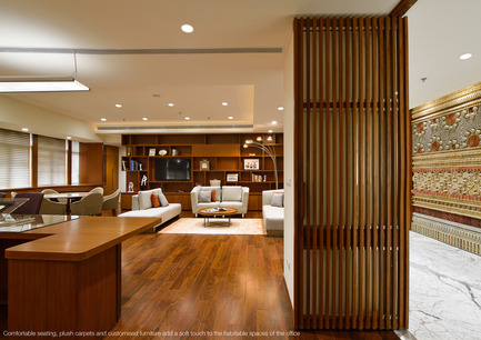
Press kit | 1124-08 - Press release | WIN Awards - Retail & Workspace Interiors Shortlist Announced - World Interiors News - Commercial Interior Design - WIN Awards 2016 - Workspace Interiors Less Than 10,000 SQM Category: Techno Corporate Office by Abin Design Studio (India)<br><br>Completed in January 2016, the interior design of this corporate office captures elegance through its simplicity. This humble sized office, all of 580 sq. m, comprises Directorsā€™ cabins, conferencing amenities, client entertainment areas, support facilitators and services. The clients at Techno Electric & Engineers Co. Ltd. wanted their office to be minimalist in design, yet magnificent in style. <br><br>ā€˜I like the hospitality feel of the project; it feels like a high-end hotel. I particularly like the use of heritage in a contemporary way, like the electrical equipment to create a feature wall. Itā€™s a very layered, very textured scheme ā€“ a lovely place to work.' MG<br> - Photo credit: Abin Design Studio 

WIN Awards 2016 – Workspace Interiors Less Than 10,000 SQM Category: Techno Corporate Office by Abin Design Studio (India)

Completed in January 2016, the interior design of this corporate office captures elegance through its simplicity. This humble sized office, all of 580 sq. m, comprises Directorsā€™ cabins, conferencing amenities, client entertainment areas, support facilitators and services. The clients at Techno Electric & Engineers Co. Ltd. wanted their office to be minimalist in design, yet magnificent in style.Ā 

ā€˜I like the hospitality feel of the project; it feels like a high-end hotel. I particularly like the use of heritage in a contemporary way, like the electrical equipment to create a feature wall. Itā€™s a very layered, very textured scheme ā€“ a lovely place to work.’ MG

Photo credit:
Abin Design StudioĀ 

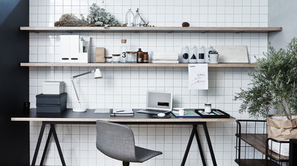
Press kit | 1124-08 - Press release | WIN Awards - Retail & Workspace Interiors Shortlist Announced - World Interiors News - Commercial Interior Design - WIN Awards 2016 - Workspace Interiors Less Than 10,000 SQM Category: RIGIdesign by LK + RIGdesign Office Design (China)<br><br>RIGIdesign is a young design team based in Shanghai. The site is located in a creative complex building, which was reconstructed from a former factory. Founder Kai Liuā€™s brief for their new office was to create a space that would be both ā€˜emotional and simple with a connection with the people.<br><br>ā€˜Itā€™s a very cohesive and simple design, which cleverly showcases the design studio. Iā€™d like to work there!ā€™ AJ    <br><br> ā€˜I love the clarity and simplicity of the RIGIdesign office and the integration of graphics and colours, but also the friendliness and homeliness of the project. Itā€™s a beautiful piece of design.ā€™ MG    <br><br> ā€˜This project had a clear narrative and stands out as refreshingly different, with clever use of what I presume is a fairly low budget in comparison to many of the other projects.ā€™ FL<br> - Photo credit: RIGIdesign

WIN Awards 2016 – Workspace Interiors Less Than 10,000 SQM Category:Ā RIGIdesign by LK + RIGdesign Office Design (China)

RIGIdesign is a young design team based in Shanghai. The site is located in a creative complex building, which was reconstructed from a former factory. Founder Kai Liuā€™s brief for their new office was to create a space that would be both ā€˜emotional and simple with a connection with the people.

ā€˜Itā€™s a very cohesive and simple design, which cleverly showcases the design studio. Iā€™d like to work there!ā€™ AJ Ā 

ā€˜I love the clarity and simplicity of the RIGIdesign office and the integration of graphics and colours, but also the friendliness and homeliness of the project. Itā€™s a beautiful piece of design.ā€™ MG Ā 

ā€˜This project had a clear narrative and stands out as refreshingly different, with clever use of what I presume is a fairly low budget in comparison to many of the other projects.ā€™ FL

Photo credit:
RIGIdesign

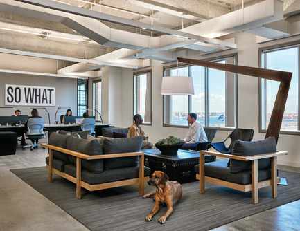
Press kit | 1124-08 - Press release | WIN Awards - Retail & Workspace Interiors Shortlist Announced - World Interiors News - Commercial Interior Design - WIN Awards 2016 - Workspace Interiors Less Than 10,000 SQM Category: Potamus Trading by Elkus Manfredi Architects (USA)<br><br>Potamus Trading asked Elkus Manfredi Architects to design its new headquarters office in Bostonā€™s Innovation District. The Potamus team of market traders, analysts, and technologists specializes in delivering high-speed electronic execution services to broker-dealers and large institutional traders. <br><br>ā€˜I LOVE the hippo! I think itā€™s fun; I think itā€™s vibrant. The palette is quite restrained, but itā€™s used intelligently. Overall it creates a very nice working environment that still feels professional, relaxed and invitingā€™. MG<br> - Photo credit: Elkus Manfredi Architects

WIN Awards 2016 – Workspace Interiors Less Than 10,000 SQM Category:Ā Potamus Trading by Elkus Manfredi Architects (USA)

Potamus Trading asked Elkus Manfredi Architects to design its new headquarters office in Bostonā€™s Innovation District. The Potamus team of market traders, analysts, and technologists specializes in delivering high-speed electronic execution services to broker-dealers and large institutional traders.Ā 

ā€˜I LOVE the hippo! I think itā€™s fun; I think itā€™s vibrant. The palette is quite restrained, but itā€™s used intelligently. Overall it creates a very nice working environment that still feels professional, relaxed and invitingā€™. MG

Photo credit:
Elkus Manfredi Architects

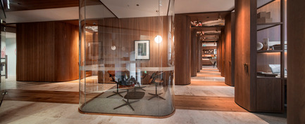
Press kit | 1124-08 - Press release | WIN Awards - Retail & Workspace Interiors Shortlist Announced - World Interiors News - Commercial Interior Design - WIN Awards 2016 - Workspace Interiors Less Than 10,000 SQM Category: Paramount by the Office Space by Woods Bagot (Australia) <br><br>Located within the iconic Paramount Pictures building in Sydneyā€™s Surry Hills, Paramount by The Office Space provides 22 handcrafted timber office suites across the 300 sq. m floor plate. Delivering a new concept in shared workspace, the design by Woods Bagot celebrates traditional joinery and artisan skills, while honouring the buildingā€™s heritage.<br><br>ā€˜I believe this is a very strong project, primarily because itā€™s a really evocative piece of design. Itā€™s a very holistic and well-considered piece from the concept right the way through to micro detailing. A very unusual and I think exceptional plan creating a whole series of interesting spaces and spaces between the spaces. The lighting creates interesting light and shade and finally I like the simplicity of the palette.ā€™ SH <br> - Photo credit: Woods Bagot

WIN Awards 2016 – Workspace Interiors Less Than 10,000 SQM Category:Ā Paramount by the Office Space by Woods Bagot (Australia)Ā 

Located within the iconic Paramount Pictures building in Sydneyā€™s Surry Hills, Paramount by The Office Space provides 22 handcrafted timber office suites across the 300 sq. m floor plate. Delivering a new concept in shared workspace, the design by Woods Bagot celebrates traditional joinery and artisan skills, while honouring the buildingā€™s heritage.

ā€˜I believe this is a very strong project, primarily because itā€™s a really evocative piece of design. Itā€™s a very holistic and well-considered piece from the concept right the way through to micro detailing. A very unusual and I think exceptional plan creating a whole series of interesting spaces and spaces between the spaces. The lighting creates interesting light and shade and finally I like the simplicity of the palette.ā€™ SHĀ 

Photo credit:
Woods Bagot

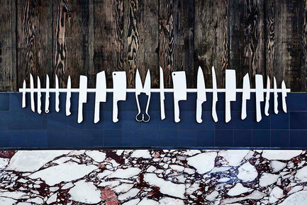
Press kit | 1124-08 - Press release | WIN Awards - Retail & Workspace Interiors Shortlist Announced - World Interiors News - Commercial Interior Design - WIN Awards 2016 - Retail Interiors Less Than 200 SQM Category: TomMarkHenry by 1888 Certified (Australia)   <br><br>1888 Certified is a unique butcher in Double Bay. Their product is sustainable, grass-fed and hormone free. The clients being fourth generation farmers are authentic and steadfast in their sustainable practices. Therefore the interior had to align with this ethos, and help to tell the story of the producers, and it was important to the clients that their customers engaged with their story.   <br><br>ā€˜Iā€™m not a big meat eater, but I think this project is quite exciting and makes you want to order fillet steak!. Itā€™s beautiful and elegant and I particularly like the choice of marble that looks like the marbling on meat, and yet it elevates it and makes it rather special. The display of all the knives is arranged so beautifully, that you would be tempted to go in to see the ā€˜poetry of butcheringā€™ for yourself.ā€™ CA - Photo credit: TomMarkHenry

WIN Awards 2016 – Retail Interiors Less Than 200 SQM Category:Ā TomMarkHenry by 1888 Certified (Australia) Ā Ā 

1888 Certified is a unique butcher in Double Bay. Their product is sustainable, grass-fed and hormone free. The clients being fourth generation farmers are authentic and steadfast in their sustainable practices. Therefore the interior had to align with this ethos, and help to tell the story of the producers, and it was important to the clients that their customers engaged with their story. Ā Ā 

ā€˜Iā€™m not a big meat eater, but I think this project is quite exciting and makes you want to order fillet steak!. Itā€™s beautiful and elegant and I particularly like the choice of marble that looks like the marbling on meat, and yet it elevates it and makes it rather special. The display of all the knives is arranged so beautifully, that you would be tempted to go in to see the ā€˜poetry of butcheringā€™ for yourself.ā€™ CA

Photo credit:
TomMarkHenry

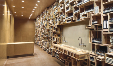
Press kit | 1124-08 - Press release | WIN Awards - Retail & Workspace Interiors Shortlist Announced - World Interiors News - Commercial Interior Design - WIN Awards 2016 - Retail Interiors Less Than 200 SQM Category: Aesop Fillmore by NADAAA (USA) <br><br>A careful balance is inscribed in the installation proposed for the signature shop for Aesop on Fillmore Street in San Francisco. Born from the fascination with pre-20th century apothecaries and 21st century body care, the Fillmore Street shop responds to the specific spatial and programmatic contexts through material, circulation and fabrication. <br><br>ā€˜Itā€™s yet another one of those successful Aesop stores where they showcase their brand identity with different materials and different architects and designers. The simplicity of the store makes it so easy to shop because all the products are on one side. The use of reclaimed materials is obviously an extremely good thing.ā€™ HB <br><br>ā€˜As always Aesop have delivered a very pure brand environment. I particularly like the simplicity of materials used in a really committed way. Having all of the focus on one side of the store (product) is very impactful. I've visited this store in person and believe they've delivered a fitting but unique store for that particular area.ā€™ MM - Photo credit: NADAAA

WIN Awards 2016 – Retail Interiors Less Than 200 SQM Category:Ā Aesop Fillmore by NADAAA (USA)Ā 

A careful balance is inscribed in the installation proposed for the signature shop for Aesop on Fillmore Street in San Francisco. Born from the fascination with pre-20th century apothecaries and 21st century body care, the Fillmore Street shop responds to the specific spatial and programmatic contexts through material, circulation and fabrication.Ā 

ā€˜Itā€™s yet another one of those successful Aesop stores where they showcase their brand identity with different materials and different architects and designers. The simplicity of the store makes it so easy to shop because all the products are on one side. The use of reclaimed materials is obviously an extremely good thing.ā€™ HBĀ 

ā€˜As always Aesop have delivered a very pure brand environment. I particularly like the simplicity of materials used in a really committed way. Having all of the focus on one side of the store (product) is very impactful. I’ve visited this store in person and believe they’ve delivered a fitting but unique store for that particular area.ā€™ MM

Photo credit:
NADAAA

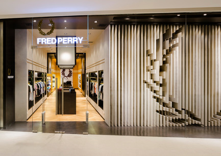
Press kit | 1124-08 - Press release | WIN Awards - Retail & Workspace Interiors Shortlist Announced - World Interiors News - Commercial Interior Design - WIN Awards 2016 - Retail Interiors Less Than 200 SQM Category: Fred Perry Bangkok by BuckleyGrayYeoman (United Kingdom) <br><br>BuckleyGrayYeoman were commissioned by Fred Perry to design their latest international store within the new EM Quartier Mall, in Bangkok, Thailand. The brief was to bring the brand's iconic English identity to an already culturally rich city within a unit providing 365 sq. m of retail space.<br><br>ā€˜Fred Perry Bangkok has a very engaging shop front. Itā€™s a very confident brand experience, and perfectly lifts the product for this market.ā€™ SK <br><br>ā€˜I think this is a great design. I particularly love the sculptural facade/window. The execution is very sophisticated. The clean lines and references really help to elevate the product.ā€™ MM - Photo credit: BuckleyGrayYeoman 

WIN Awards 2016 – Retail Interiors Less Than 200 SQM Category:Ā Fred Perry Bangkok by BuckleyGrayYeoman (United Kingdom)Ā 

BuckleyGrayYeoman were commissioned by Fred Perry to design their latest international store within the new EM Quartier Mall, in Bangkok, Thailand. The brief was to bring the brand’s iconic English identity to an already culturally rich city within a unit providing 365 sq. m of retail space.

ā€˜Fred Perry Bangkok has a very engaging shop front. Itā€™s a very confident brand experience, and perfectly lifts the product for this market.ā€™ SKĀ 

ā€˜I think this is a great design. I particularly love the sculptural facade/window. The execution is very sophisticated. The clean lines and references really help to elevate the product.ā€™ MM

Photo credit:
BuckleyGrayYeomanĀ 


Source link

Save This Post
Please login to bookmarkClose

Up Next

RECOMMENDED