L’Aire Visuelle, optométristes – opticiens
la SHED architecture
Montreal, Canada, 2014-01-14 –
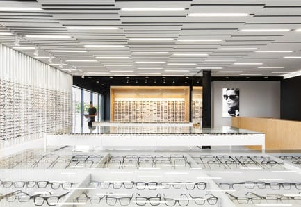
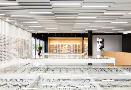
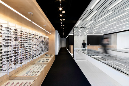
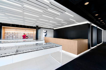
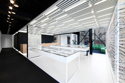
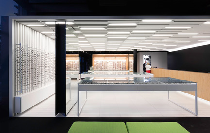
Working from high contrast and simple natural materials, the firm la SHED architecture have designed a unique optometrist and optician clinic redefining the customer’s experience. The commercial space was designed as an atelier-boutique, characterized by low display tables in the open area, avoiding any visual obstruction. Looking for frames becomes the opportunity of a friendly exchange, underneath the bright ceiling, composed of wooden slats installed randomly.
Creating a hierarchy of movements between patients and employees was an essential part of optimizing displacements and creating a functional environment.
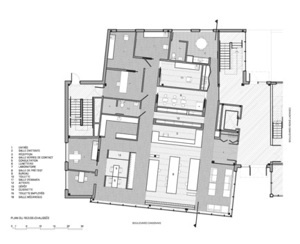
The project mandate consisted of planning and developing an optometry clinic and its eyeglass store at the ground level of an existing two floor commercial building. With windows on three facades, the 3060 square foot office accessible from a common hall had an irregular shape – a portion of which had a misaligned angle in relation to the main structural frame. A space with double the height opening onto the second floor dental clinic offered an abundant amount of natural light. The client’s budget was limited to a maximum of 450 000$ for the entirety of project work involved including mechanical work, furniture and professional fees.
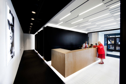
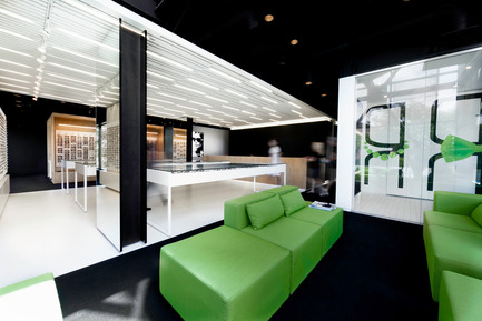
The space was designed in such a way to position the sales area at the front of the building, in the section that contained the most windows and was closest to the entrance. People walking into the clinic could therefore instantly see all available products. Visible from the reception, the waiting area was placed beneath the office’s area of double height and is apart from the consultation rooms while being open to the sales area. The two main axis of circulation are on either side of the reception area – one being meant for clients heading for consultation and examination rooms, and the other for clinic personnel heading to the employee common room, apart from the client zone. The design hierarchy was therefore established, with busier areas at the front near the entrance, and areas requiring quiet and privacy located at the rear of the office.
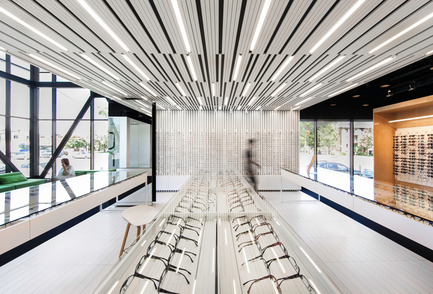
The concept, geared towards the creation of a workshop-boutique, opted for presentation tables in order to keep the display area clear of all obstacles limiting vision or obstructing lighting. As a result, the eyeglass frame shopping area turns into a far more friendly area, where artificial light is articulated within a randomly organized ceiling of lath wood. The ceiling, by its dynamic and rhythmic design, creates an illusion of movement within the adjacent space. In the spirit of architectural continuity, a wall of vertical lattice creates a space for attaching eyeglass frame presentation modules while enveloping the sales area. The long and narrow ceramic tile flooring is a harmonious continuation of the lath wood ceiling, therefore completing the envelopment of the sales area.
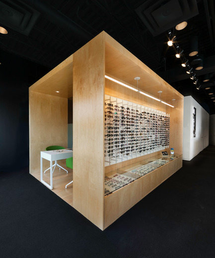
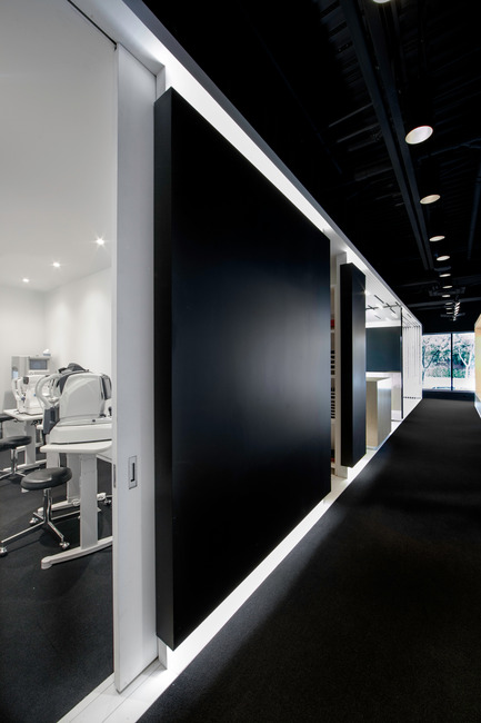
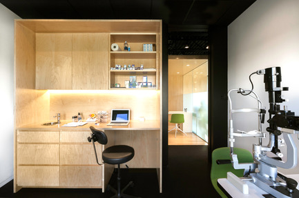
The immaculate white band that is the showroom is a start contrast to the wooden monolithic cube immediately adjacent to it, covering the private consultation areas. Behind the sales floor, a black satin volume containing the exam rooms seems to have slipped under the ceiling lath, creating an attractive backdrop to the reception area. Detached from adjacent surfaces by recessed lighting, this volume, fragmented by full height openings, seems to float gingerly between the floor and ceiling. The highly contrasted colors provide the area with a theatrical character featuring the eyeglass showroom with its bright white presentation modules, whereas the mechanical and unaesthetic elements of the open ceiling disappear in black. A sober, neutral and classical color palette ensures a total coherence between different elements of the clinic.
A black carpet covers the floor in circulation and consultation areas, absorbing sound and light emitted by the sales area. Fluorescent tubes randomly built into the lattice ceiling frame animate the sales area by producing bright and stimulating lighting in stark contrast to the other more private spaces. Black cylindrical tubes hidden throughout the mechanics and structure provide rich and soft lighting in the circulation, waiting and consultation areas as opposed to the abundant lighting of the showroom.
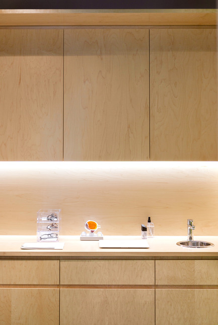
The contrast of porosity, colors and textures within the project elegantly reflect the different character of each space, and contribute to a simple and clear understanding of the planning of the office. Refined finishing details such as doors with hidden frames, and recessed plinths contribute to the clean appearance of the various spaces, underscoring the strong architectural ideas implemented to make L’Aire Visuelle a contemporary and elegant optometry clinic.
La SHED architectureMission Statement
As a company that performs the majority of its work in the residential and commercial sectors, la SHED has developed a thorough expertise in the renovation, transformation and construction of buildings of all types and all historical backgrounds. Openness, lighting and alignment are at the very core of all projects completed by the studio. Its achievements stand out as a result of their functional and contemporary layout, as well as their use of materials that are durable, affordable and classical. The importance given to finishing touches and the general quality of its achievements is, amongst other reasons, a result of tight monitoring throughout the entire project execution process from start to end of construction. The reconfiguration of exiguous spaces, the optimal usage of space and dealing with precise and restrictive budgets are all constraints that la SHED has excelled at dealing with in the past, managing to conceive seductive and intelligently designed spaces regardless of limitations.
The firm was established when architect associates Sébastien Parent, Yannick Laurin, Renée Mailhot and three talented employees all united by a passion for architecture, design and Montreal, decided to team up to form La SHED. The studio is dedicated to a new type of architectural relationship, where to call an architect would scarcely be stranger than hiring a accountant – a relationship where conceiving your own living space would neither be a luxury nor would it be utopic.
La SHED offers an innovative and inclusive approach for its renovation, expansion and new construction projects. This approach makes architectural services accessible for any scale of project as well as any budget. It is also for the purpose of accessibility that the firm has chosen to make its home in a storefront boutique location. The workshop, visible from the street, is configured in order to optimize teamwork, an essential ingredient in stimulating creativity. Weaker ideas are eliminated for the benefit of the more creative ones. The synergy of the la SHED team can be felt not only in project work, but also in the conviction that architecture can be done differently by developing partnerships with people who choose to invent, or reinvent, their lifestyle.
Upon completion of its second project, la Maison Demers, la SHED was overwhelmed with critical success and has since been highlighted in a number of specialized magazines and has received a variety of design awards. Notably, the firm is the recipient of the 2016 Emergent Architectural Practice Award given by the Royal Architectural Institute of Canada (RAIC). Even though the team now has nine members, all decisions are made as they were on the first day – they are “submitted to the board” around the same large table.
Project name: L’Aire Visuelle optométristes-opticiens
Localisation: Laval, Québec
Inauguration: March 24th, 2013
Clients:
Sylvain Duquette
Hélène Turgeon
Suzie Pelletier
Architect: la SHED architecture
Photo credits: Maxime Brouillet
– 30 –
-
- la SHED architecture
- [email protected]
- 514.277.6897
Maxime Brouillet
~
4.2 MB
Maxime Brouillet
~
6.3 MB
Maxime Brouillet
~
9.5 MB
Maxime Brouillet
~
2.2 MB
Maxime Brouillet
~
1.8 MB
Maxime Brouillet
~
2.3 MB
Maxime Brouillet
~
5 MB
Maxime Brouillet
~
4.4 MB
Maxime Brouillet
~
6.8 MB
Maxime Brouillet
~
11 MB

Maxime Brouillet
~
4.4 MB
Maxime Brouillet
~
2.4 MB
Maxime Brouillet
~
2.2 MB

Maxime Brouillet
~
2.5 MB
la SHED architecture
~
720 KB


