Canadian Pavilion at the Shanghai world expo 2010
Saia Barbarese Topouzanov architectes
Shanghai, China, 2010-08-30 –
The will to develop cities that are at the same time inclusive, creative and sustainable is above all the quest for an ideal, an immense societal project that must be ceaselessly nourished and renewed through the efforts of the greater Canadian community nationwide. It is this large-scale and, at the same time, thoroughly human project that seemed to represent for us the fundamental element of our identity, the centre around which the architectural concept and experience of the pavilion should gravitate.
The pavilion’s architecture layers and weaves together a series of intertwined metaphors at different scales. The first represents the country, and serves as site for the second, that of the city, which in turn encompasses that of the town square.
The architectural parti distinguishes two closely related entities:
The building as a looped ribbon
The interior court as a circumscribed public square
The building
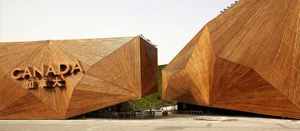
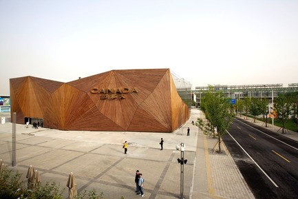
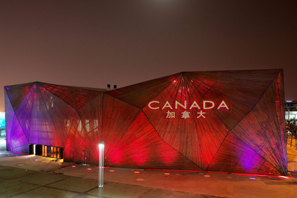
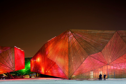
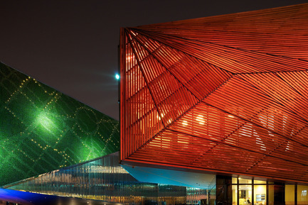
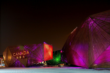
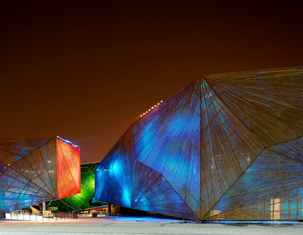
Mimicking the territorial disposition of cities described above, the long, bar (ribbon) of the building supplely coils between the slender ends of the allotted terrain’s perimeter. In this way, it supports the idea of a loop that unifies in spite of distances. It projects the image of a country that embraces that which it holds most dear: its population. The continuous path between entrance and exit suits the program of public performances, creating a platform upon which a series of events may unfold. Their starting point will be in the interior court left free at the centre of the pavilion that encompasses it.
The Interior court, public square or urban room
Center, public square or urban room, it is the place where urban life crystallizes and is renewed.
Symbolized by the physical form it adopts and the characteristics that emanate from it, the court evokes the true nature of city.
First, it is porous
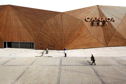
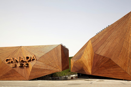
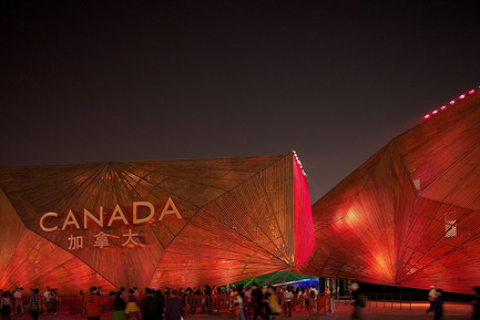
At times resting on the ground, at others hovering, rising, lifting, and straightening, the ribbon building creates passages equivalent to roads, lanes and alleys that invite visitors to make their way into the central square. On the west side, one of the covered passages slips under the raised slopes of the structure. It straddles a pool of water of engaging coolness. On the side of America Square, the entrance, open to the sky, is manifest by a large notch in the building which is adjacent to the welcoming protection of two raised extremities offset from one another. These varied access points render the pavilion permeable to the curiosity of the visitor who is drawn towards this place, through a glimpse, intriguing by its atmosphere and activities.
Second, it is inclusive
The walls that circumscribe the square define its nature. These vertical surfaces, at times covered with greenery, at times with a reflective material, maintain the sense of a protective, enveloping enclosure as they palpably extend the space towards other possible places, like getaways to the sky or boundless landscapes of a vast country. In addition, these walls frame the court and hold the power to draw attention toward the nerve-centre which they create. This place, like a town square, depicts city living, and mirrors this aspect by favouring encounters, exchanges, and interactive participation. Creativity can be released to provoke a spontaneous event in an artistic and fun manner.
THE SYSTEM OF CONSTRUCTION TAKES SUSTAINABLE DEVELOPMENT INTO ACCOUNT
A first shell
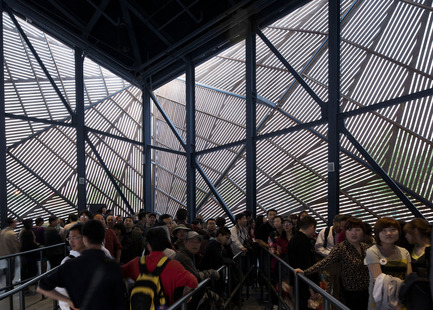
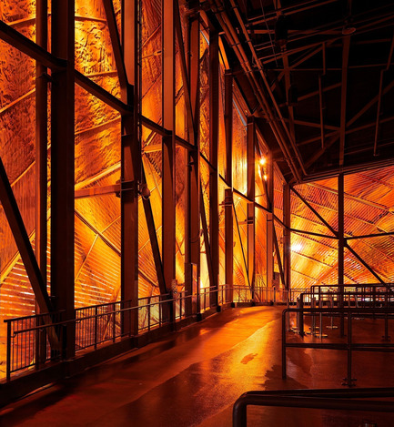
The shell constitutes the interior face of the building. Minimal in its construction, without decoration, it lays low and holds only a functional, supportive role to the spectacles that it houses, those that constitute its vibrant heart.
A second envelope
Distinct from the first, it covers the latter with a space between the two. This double wall, itself an insulating coat, reduces the energy expenditures for air conditioning.
Exterior peripheral wall
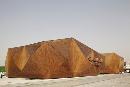
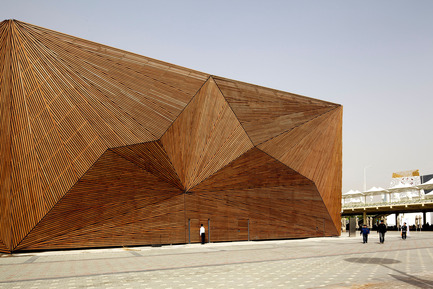
Multiple facets placed randomly sculpt the facades like crystals under the light of atmospheric, luminescent phenomena. It uses a series of flat-surfaced fans striated only by fine grooves. Wood, the Canadian material of preference – natural, renewable and recoverable – offers an infinite variety of effects depending on the hour of the day or the quality of light.
CANADIAN PAVILION AT THE SHANGHAI WORLD EXPO 2010
Team
Client name: Canada Heritage
Creation producer: Cirque du Soleil
Creation director: Johnny Boivin
Line producer: Carole Samson
Project manager: Pascal Richer
Name of architectural/design firm: Saia Barbarese Topouzanov architectes
Project leader: Mario Saia
Design team members: Vladimir Topouzanov, Sam Yip, Mathias Losco, Patrick Meirim de Barros
Engineering: Lavalin
Construction drawings: ABCP Architecture – The architectural Design Research University of Tongji University
Main contractor: Lavalin
Other specialist designers/consultants: landscape: NIP paysage
Lighting design: Lightemotion
CANADA DESIGN book
Project
Location: City, province: Shanghai, China
Design start date: 2009
Design end date: 2010
Construction start date: 2010
Construction end date: 2010
Site area: not available
Built area: not available Budget: not available
Cost per sq. metre / per sq. ft.: not available
Status: not available
Photographer: Patrick Alleyn
– 30 –
-
Saia Barbarese Topouzanov architectes
- Annie Lévesque
- [email protected]
- 514.866.2085
Patrick Alleyn
~
60 MB
Patrick Alleyn
~
22 MB
Patrick Alleyn
~
60 MB
Patrick Alleyn
~
22 MB
Patrick Alleyn
~
60 MB
Patrick Alleyn
~
20 MB
Patrick Alleyn
~
13 MB
Patrick Alleyn
~
20 MB
Patrick Alleyn
~
22 MB
Patrick Alleyn
~
60 MB
Patrick Alleyn
~
22 MB
Patrick Alleyn
~
22 MB
Patrick Alleyn
~
52 MB


