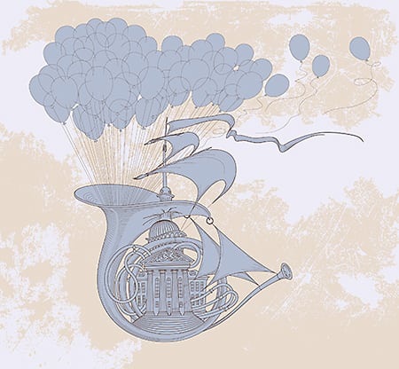
In this video, I critique your logo submissions! There are so many submissions so I’m glad to be able to help you guys out in this way. The main takeaway in this critique is to keep the design simple and not to be overzealous in your ornamentation!
*Sponsored By Freshbooks! Click here to get 1 month free! https://www.freshbooks.com/willpaterson
Instagram: http://instagram.com/willpat
Thanks for watching! Hope you enjoyed this video!
If there’s anything you would like me to cover in a Youtube Video, then let me know by commenting down below!
If you like what I do, and you want to partner with me:
Partner with me through Patreon : http://patreon.com/user?u=35829
Hire me: http://www.williampatersondesign.com
If you would like me to design you a logo, poster or anything for your Youtube Channel or business, then I’m your man! I would love to work with you to make what you want a reality! Check out my website and portfolio for more information.
Hire me: http://www.williampatersondesign.com
source


