A v2com exclusive
Winner announcements for the WAN Commercial, Colour, Metal & Small Spaces Award 2015
World Architecture News Awards (WAN AWARDS)
The World Architecture News Awards WAN AWARDS is a truly unique international architectural awards programme.
Brighton, United Kingdom, 2016-03-16 –
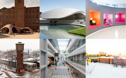
We are pleased to announce the winners of the WAN Commercial / Colour / Metal / Small Spaces Award 2015.
A total of 22 categories are represented throughout the year and every two months areas as diverse as Adaptive Reuse, Transport, Performing Spaces and Waterfront Architecture are judged by our extensive panel of top international experts.
The judging panels themselves create a passionate and thought-provoking debate and for a project to make it through this rigorous process and come out on top is a true test of its creative quality and credibility. You only have to look at the testimonials page to read some of the thoughts of previous winners and shortlisted entrants to see how much it means to them and practices here. The 2016 WAN AWARDS calendar is available for download here: http://backstage.worldarchitecturenews.com/wanawards/testimonial
WAN Commercial Award 2015 Winner
C.F. Møller Architect’s Bestseller Office Complex stand-out winner
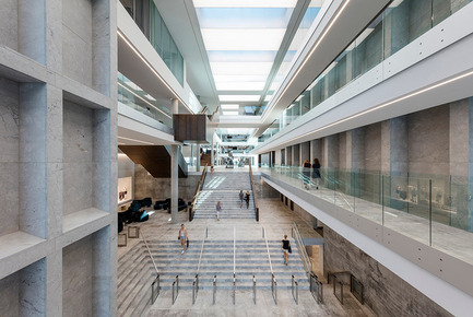
We’re delighted to announce the winner of the WAN Commercial Award 2015 as C.F. Møller Architects for their Bestseller Office Complex in Aarhus, Denmark – congratulations!
The winner was selected from six shortlisted projects by our jury panel of industry leaders. The WAN Commercial 15 jury consisted of: John Drew, Principal at Pringle Brandon Perkins+Will, Kent Jackson, Design Director at Skidmore, Owings & Merrill, David Lawrence, Managing Director of Flanagan Lawrence, Brendon Moss, Project Director at Qatari Diar, Liz Peace CBE, Chief Executive of the British Property Federation and Matt Yeoman, Founding partner of BuckleyGrayYeoman.
The jury’s brief was to find only one winner from a fine array of commercial projects from across the globe. It was a difficult task, but after much discussion and debate the jury decision was unanimous in favour of the Bestseller Office Complex with John commenting: “It’s a clear winner for me, an amazing commercial space.”
The office complex resembles a varied flotilla of buildings at different levels, which are connected by a series of outdoor spaces like atria, courtyards, terraces and roof gardens. Kent shared his thoughts: “The spaces and the roof terrace are very impressive, a real standout winner.” The sustainability was another aspect that impressed the judges. The office complex uses sea-water cooling and solar heating ensuring energy consumption 50% lower than the minimum requirements stated in the building regulations. Kent added: “The fact that the energy consumption is 50% less than code is another plus.”
The mixture of office buildings and outdoor spaces creates the impression that this is a town within a town. The complex, surrounded by canals and lakes on all four sides, forms the entrance to the new, urban district on the waterfront in Aarhus, Denmark. The façades are designed on two design principles: Reliefs in light natural stone frame deep window niches in the parallel north and south façades. By way of contrast, the east and west façades are simple, transparent glass façades framed with natural stone. David also shared his thoughts describing the office complex as “A beautifully crafted building which fits the brief.”
Following a strong debate over the six shortlisted projects, all the judges agreed on their eventual winner. Matt commented on why C.F. Moller Architect’s project was chosen: “This office building by CF Moeller stands out from the others as a sophisticated response to its context. The strategy of breaking a large volume into linked smaller parts helps to integrate the building into the existing surroundings because the scale of the component parts is sympathetic to the old town nearby.”
We’d like to take the opportunity to thank not only the jury, but all who entered their projects into the 2015 WAN Commercial Award.
WAN Colour in Architecture Award 2015 Winner Fortunen AS claim the title for this year’s Colour Award
The WAN Colour in Architecture Award recognises the use of colour in architecture whether it be applied colour, LED lighting systems, using colour within a structure or materials such as metal or glass to enrich architecture, enabling it to communicate with its users and environment.
The six outstanding shortlisted projects, showcased a fantastic selection of the use of colour to express identity, wayfinding, to stand out or just to enhance and complement the typology. After some lengthy discussions, it was unanimously decided that Fortunen AS would be awarded as the winners for 2015 – Congratulations!
The established panel involved in this category were; Jack Carter Associate, Renzo Piano Building Workshop, Stephen Light Architect, Rogers Stirk Harbour + Partners, Morag Morrison Partner, HawkinsBrown and Stefan Rappold Partner, Behnisch Architekten.
Bønsmoen Primary School is located within a small housing community in Norway and was an existing school from the 1960’s. The renovation involved exposing and transforming the existing structure and adding a new building. The former structure was strict and rational, but had redeeming space qualities. The aim was to create a tight integration of different functional areas with clear and flexible usability. Entrances to the different age group areas were decentralised, and clearly readable entrances were introduced to tie together the indoor and outdoor areas. Stefan expressed his views on this mentioning, “The interior and exterior works well together. I have the feeling that these guys had a broader view and conceptual image of the building.”
The different age group areas were also selected using different colours and repeating these within the interiors. Each class has their own “group of colours” and the use of colour has a meaning. The chosen colours purpose is to give an existing visual play, as well as the colours working as an organising and identification tool. Colours are also used as leading elements for the disabled. Fortunen AS believe that movement stimulates learning, such as wandering, climbing, playing etc. Moving through an environment, not only to promote physical form, but also to create visual experiences with colours. Morag liked their concept and had the jury agreeing with her comments by saying, “I really like this design. I think that the colour is very well thought through for the children. Using colour for children to relate to, the play and learning thing I think is very clever. This is what you think of as colour in architecture.” Inside, the age areas are subdivided by fixed furniture elements such as kitchens, group spaces and podiums, which are also used as performance stages and rest areas. All colours have a warm palette, and used so the colour elements appear as a whole in a more general landscape.
Fortunen AS believe that the quality of life is closely connected to the communication between humans and their surroundings, which equates to having inspiring spaces, cheerful colours, living materials and a good environment which is of the greatest importance to create this quality of life. They believe that the Nordic light, darkness and the almost black and white winter scenes, require for an extensive use of colours in their environment. Morag concluded, “They have seen the colour design all the way through, and it is very strong. They have stuck to the concept and executed it well.”
WAN AWARDS would like to congratulate Fortunen AS for winning this year’s Colour in Architecture Award 2015. We would also like to thank all those who entered, along with our respected jury panel for their experience and sincere discussion on all projects.
WAN Metal in Architecture Award 2015 Winner
HENN awarded as the winner for their Porsche Pavillon
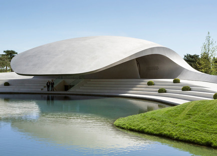
It is with great pleasure that we champion HENN as the winners of the WAN Metal in Architecture Award 2015 for their striking Porsche Pavillon at Autostadt Wolfsburg, Germany project- Congratulations!
The winner was selected from six shortlisted projects that were chosen by our jury panel. On this year’s panel were: James Dixon, Associate Director for John McAslan + Partners, Damian Eley, Associate Director for Arup, and Harbinder Singh Birdi, Partner at HawkinsBrown. The judges felt that the six shortlisted projects highlighted a great variety for metal in architecture, emphasising fantastic examples of what’s possible in this category. However, they were all in agreement that there was one clear winner on the day.
The characteristic silhouette is a striking icon within the theme park lagoon landscape. The new brand pavilion of the sports car manufacturer is presented as an organically shaped structure with a curved, softly gleaming roof construction. Curving lines and exciting bends make the Pavilion a dynamic yet reduced sculpture with its physical appearance resulting from the Porsche brand image.
A matte finished stainless steel cladding forms the flush envelope of the vibrant construction, creating the impression of a homogeneous unity, whilst creating a continuously changing appearance depending on light and weather conditions. The pavilion’s entrance side protrudes out for a total of 25 metres above the lagoon’s water surface. Inside the pavilion is a concentrated space which opens out to provide a tangible experience of the sports car brand and its history.
The judges were stunned by the finish of the building, questioning the use of material several times. Damian questioned: “it is metal? Wow. It surprises you that its stainless steel because it looks like concrete but actually it’s metal.” James agreed, adding: “it’s gorgeous, isn’t it? Beautiful form”.
Under the large, asymmetrically shaped roof, a sheltered external space opens up with seats for several hundred visitors, being optically connected to the surrounding landscape and forming its own acoustic enclosure. The architecture and landscape, interior and exterior, roof and façade are designed as a uniform, flowing continuum, while the exterior of the pavilion designed by WES Landschafts Architektur has been integrated into the overall concept of the theme park. Similar to the type of production used in lightweight construction in the automotive and aircraft industries, the space-forming building envelope assumes a supportive function. A total of 620 stainless steel sheets have been welded together with reinforcing ribs, prefabricated in a shipyard in Stralsund and assembled on site.
Harbinder closely examined the project’s construction process, concluding: “whats interesting is that they have taken a very interdisciplinary approach of design, fabrication and construction of the building which I think is very important and progressive. We should promote the fact that these designers have worked interdisciplinary and disciplines to come to a solution.”
We’d like to take the opportunity to thank not only the jury, but all who entered their projects into this years’ WAN Metal in Architecture Award.
WAN Small Spaces Award 2015 Winners
META-Project and Map13 Barcelona are crowned joint winners
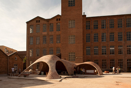
It is with great pleasure that we champion both architectual firms, META-Project and Map13 Barcelona, as the winners of the WAN Small Spaces Award 2015. META-Project came first in the permanent sub-category for their striking Water Tower Renovation project and Map13 Barcelona came first in the temporary sub-category for their impressive Brick-topia scheme.
The winners were selected from 12 shortlisted projects that were chosen by our jury panel. This year’s panel were: James Furzer, Architect at Spatial Design Architects, Naomi Milgrom AO, Chair of the Naomi Milgrom Foundation, Doan Thanh Ha, Founder of H&P Architects, and Carl Turner Founding Director of Carl Turner Architects.
Permanent
Attracting wide spread attention from the public and the residences, META-Project adaptively renovated the water tower in an attempt to engage community life. Located in the campus of a rundown military factory, formerly known as the People’s Liberation Army No.1102 Factory that was founded in 1959 during the Great Leap Forward. Naomi felt the scheme was: “Imaginative upscaling and reimagining of a historic structure.”
The water tower is re-interpreted and transformed into a new type of ‘public folly’ – an ambiguous built object that transcends the common usage to which it belongs, and suggests some other public purpose. On the outside it forms an attractive intervention in the urban landscape, and on the inside it offers a space for public activities for the nearby communities. James commented: “The juxtaposition between the urban exterior and the colourful internal public space is simply beautiful and engaging. The water tower has had a second breath of life, which has become a heartbeat for the local community progression.” Carl went on to say: “An interesting example of how architecture can adopt memory as a means to deliver community engagement.”
The ‘public folly’ can now house a number of activities, including: casual gathering, movies, performance and a mini-café. It invites people to engage and rethink the co-existence of history and contemporary reality. Doan concluded: “This is an interesting example of the ability to restore the likely disappeared space and usher in common space for future community from the closed past.”
Temporary
Brick-topia was the winning project of a competition to build a pavilion at the International Festival of Architecture Eme3, in Barcelona. An unreinforced masonry shell made of brick using a traditional construction technique called tile vault, the scheme was the result of the combination of the latest structural analysis and form-finding computational tools with a traditional, sustainable, cheap and effective construction technique. “An interesting example of how traditional techniques can be deployed to realise challenging geometries” stated Carl.
The shape of the pavilion is the outcome of a thorough design process optimising the structure through geometry with the software RhinoVault. James was particularly taken with this scheme, saying: “This project is a fantastic piece of architecture. The form allows the user to experience the shelter in a way that makes them think about the construction prior to their interaction. A heavy, solid material, that creates a light, soft tensile-like structure. Exploring the boundaries of brick construction superbly! A striking piece of architecture that successfully uses innovation to create something of beauty.” Naomi went on to say the project had a: “Highly expressive use of material using traditional vaulting techniques.”
The unreinforced masonry shell showed a complex geometry with a thickness ranging from 65 mm to 118 mm and it was designed to present challenging features in terms of structure and construction. Impressed with the use of material, Doan commented that this was: “A step that broadens the knowledge of use of bricks in architecture and gives inspiration to the future applications featured with brick material.”
The strong constraints on budget and time also required innovation in the construction process. The pavilion was built in three weeks and within that time a new falsework system was developed using scaffolding, cardboard, wire, and steel rods. The system allowed a quick, economic and low-tech construction available in almost any kind of context.
We’d like to take the opportunity to thank not only the jury, but all who entered their projects into the 2015 WAN Small Spaces Award.
– 30 –
- World Architecture News Awards (WAN AWARDS)
- Francesca Maw
- [email protected]
- 01273201109
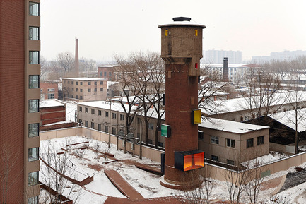
Water Tower Renovation by META-Project
© META-Project
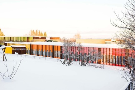
Bønsmoen primary school by Fortunen AS
© Merethe S Odland
Brick-topia by Map13 Barcelona
Brick-topia by Map13 Barcelona
Bønsmoen primary school by Fortunen AS
© HG Esch
Bestseller Office complex by C.F. Møller Architects
© Adam Mørk


