A v2com exclusive
Mantab Workplace
S/LAB10
Behind the gleaming facade hides the social space that mixes with business
Kuala Lumpur, Malaysia, 2019-02-18 –
Mantab Workplace is one of S/LAB10’s latest endeavours. Comprising a complete internal overhaul of an existing bungalow—the team was required to re-examine the office/workspace typology in a Southeast Asian climate and locality for a local property development company in Kuala Lumpur Malaysia in producing the final design scheme. The firm required not just a workspace for its growing team, but also a series of spaces for hosting and entertaining their clients. As such, the existing single unit, multi-storey former residence was transformed into a gleaming corporate hub for a private entity that seamlessly integrates business and leisure.
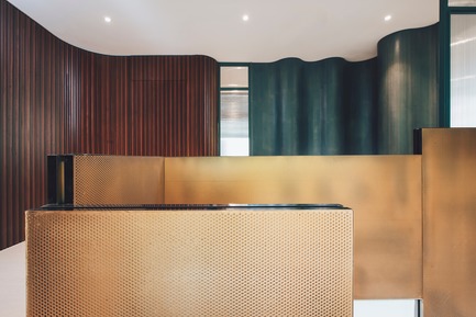
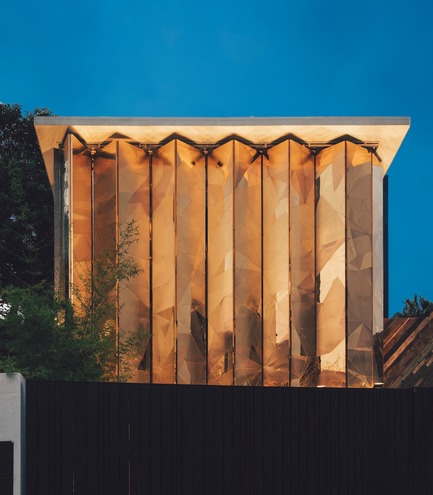
What stands out in particular in Mantab Workplace is its gleaming bold façade. Looming over the quiet suburban street, the gold-copper alloy façade rises up from the building’s ground level in shielding its interior furtively. The triangulated facets of the matte- and highly polished finishing of gold-copper alloy are seemingly arbitrary–but in essence are conceptually extrapolated from the corporation’s name and brand. Translated from Malay language, “mantab” means solidity; an unshakeable integrity. The designers likened this to the hardiness of a diamond—with no single facet on the jewel alike, yet abound with impeccably hardy beauty. Inspired as well by the Malaysian shophouse vernacular of folding iron shutters, the gold-copper alloy clad folding panels are hinged and operable. Whether angled half-shut with its interiors peeking out to its suburban extents, or closed in entirety for privacy and to keep out the glare of tropical light out—the façade is eye-catching and captivating, with the allure of it leaving many a visitor guessing what lies within.
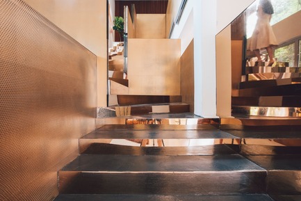
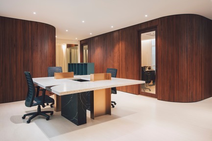
The design brief was unusual: to create a series of spaces within the building to suit a variety of purposes that ranged from business to social. Thus, S/LAB10 was tasked to revise and challenge the norms of an office typology. The new programme was to include offices for the company’s three directors as well a display gallery and numerous leisure spaces for hosting clients. The team sought to fulfil the client’s requirements by delivering a design that not only re-worked the aforementioned, but also resulted in a comprehensive design scheme that was both visually striking and practical in its function. The project inherits the house’s basic structure (which proved advantageous in dealing with the site’s naturally steep incline). In place, is a dexterous play of cantilevering volumes, contrasting surfaces, materials and texture, as well as the considered use and design of intricate details throughout. The consolidation of the building’s existing structural framework with a bold play of surface and volumetric elements culminates in a strong, sensual spatial experience and language throughout. And subsequently, a confident, bold architectural presence and visual identity for the client prudently set within the existing building’s typology.
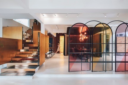
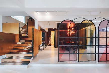
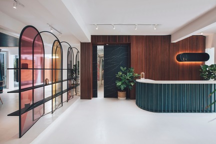
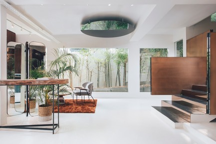
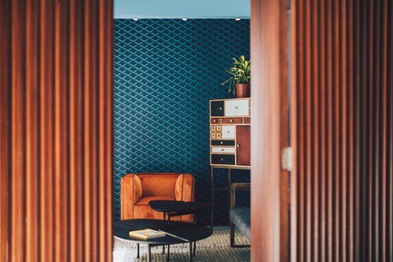
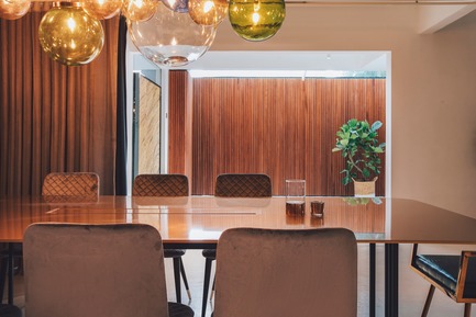
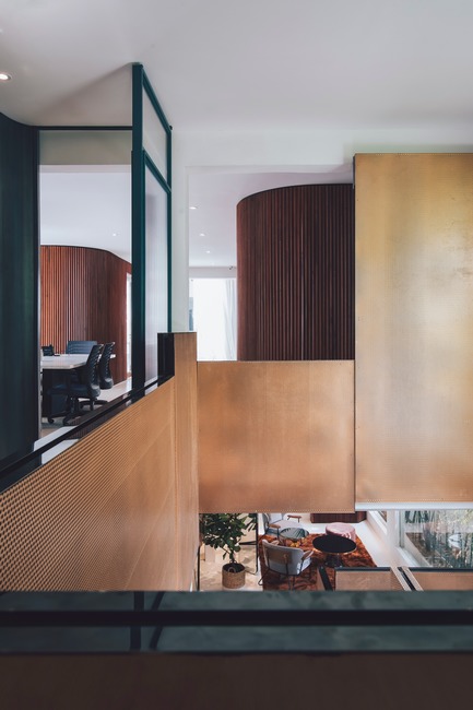
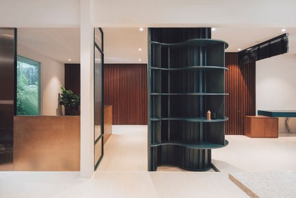
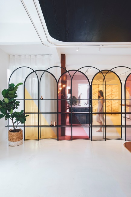
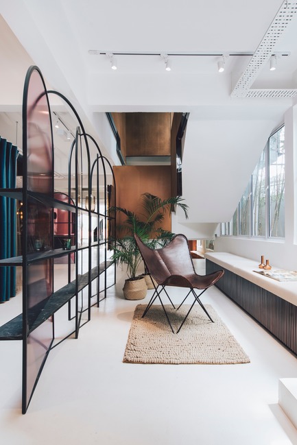
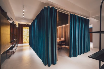
In fulfilling the client’s unique hybrid brief, the team at S/LAB10 recognised the brief’s key challenge: delivering a spatial scheme that was simple in nature, but suitably addressed the brief’s complex demands. Contrasts was a key design strategy employed by the designers in approaching this brief. A strong theme of bold yet methodical contrasts, or as the designers put it: “intentional mismatches”, is evident throughout, as articulated in the design’s volumetric handling of spaces as well as the contrasting play of colours, textures, materials and, in particular, its complementary custom detailing. The division of spaces are carefully considered, as were the design strategies and elements involved in this. One such example is the centrally positioned conference room on the white epoxy-floored first level. The room is surrounded by heavy but lush emerald-green privacy drapes. Left open when not in use, the curtains provide a flexible use of space that opens up the heart of the level rather than further segmenting it. On its borders are a pair of slender-framed, arched translucent screens that further aid in framing the open space. Uniquely designed and detailed for the scheme, these translucent panels of varying soft neon hues are encased in a thin black steel frame that double up as feature display shelves and add visual interest and depth to the space when viewed from different orientation derive different outcome, at times stacking of multi-layer colours or silhouette of translucent colour foreground merged with the background surrounding materials and finishes.
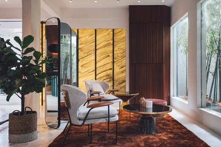
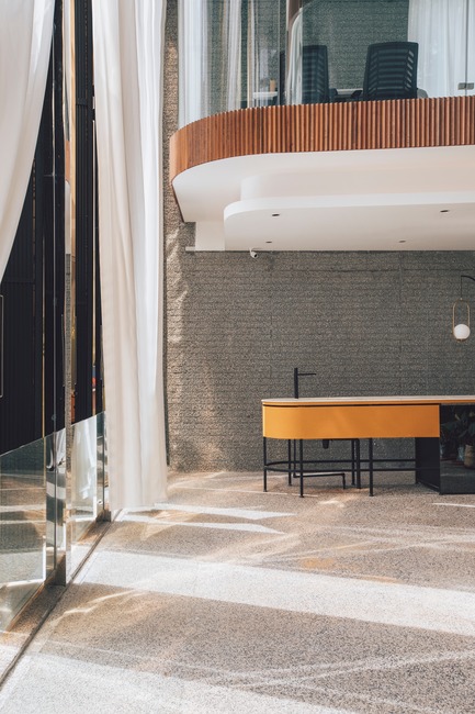
In another instance, the top two floors of the building are prominently cast in operable bright gold-copper alloy panes. Once shut, the broad gold-copper panes make way for a spaciously appointed lounge beyond, concealed behind tall curtain glass panels. To the left of this is a slighter single timber-clad volume—this marks the main entrance and balances the entirety of the façade’s composition. Contrasting in size and clad with locally sourced recycled timber, the protrusion was designed for dramatic effect. “We wanted to create an immersive volume in which to heighten one’s sense and experience of space to highlight their entry into the building,” the designers note. Hovering over the ensconced double-height lounge space are the glass-encased directors’ offices. Generously washed with natural light, the offices and lounge are cast in a soft, warm glow. Along the south-western edge of the building here, the designers have incorporated an outdoor green terrace—dubbed the “bamboo terrace”—on the first floor. In doing so, nature and the outdoors are a subtle feature that complements the scheme’s sleek corporate interior. By creatively exploring various complex configurations of volume and space with their respective custom crafted details, the designers have successfully composed a series of work and leisure spaces, both private and open, that flow effortlessly from one to the other.
Project Data
Client | Mantab Group Sdn Bhd
Location | Bangsar, Kuala Lumpur. Malaysia
Lead Architect | Jason Sim
Design Team | Hao Wang, Fion Hsu & Liz Siew
Main Contractor | WM Furniture & Renovation Sdn Bhd
Photographer | Heartpatrick
About S/LAB10
Established in 2012, S/LAB10 is a design and architecture practice founded in Sydney, Australia. The practice is made up of three fellow graduates of the University of Newcastle, Australia: Jason Sim, Hao Wang and Fion Hsu. Together they currently run projects in Australia, Taiwan, Malaysia and continue to expand their broad portfolio of works that spans in numerous locations across the Asia Pacific region.
– 30 –
- S/LAB10
- Jason Sim
- [email protected]
- +60 127347234
Heartpatrick
Heartpatrick
Heartpatrick
Heartpatrick
Heartpatrick
Heartpatrick
Heartpatrick
Heartpatrick
Heartpatrick
Heartpatrick
Heartpatrick
Heartpatrick
Heartpatrick
Heartpatrick
Heartpatrick
Heartpatrick
Heartpatrick


