Headquarter Veolia
Dietmar Feichtinger Architectes
Montreuil, France, 2017-05-17 –
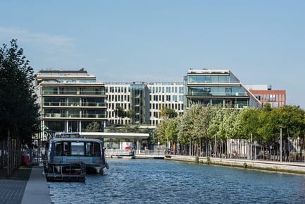
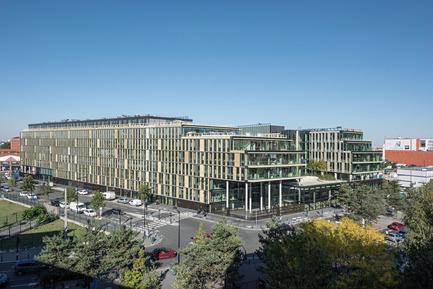
Veolia’s new headquarters is a building that enhances the new neighbourhood between Paris and Aubervilliers. It creates an optimal environment for future users, a “pleasant to live in” building with large interior gardens, terraces, windows that open and mobile sunshades.
It is a sustainable, robust and durable structure with a “direct materiality”, visible concrete and wood, and materials used in their rough state.
A strategic site, a unique project
The new headquarters includes three Veolia sectors on the same site. It houses more than 2000 people for greater efficiency, consistency and sharing.
The choice to establish the new headquarters in Aubervilliers, a town of vibrant diversity, underlines the attractiveness of the North-East Paris area and Grand Paris’ ambitions. The coexistence of offices, shops and housing is an economic, social and cultural asset for this neighbourhood.
The site, at the junction between Paris and Aubervilliers, connects the past with the future and reflects Veolia’s history: the former industrial site reconverted into a modern centre for research and innovation. Opposite the dock, in a rapidly changing neighbourhood, this strategic site is consistent with Veolia’s image of excellence. The future dense urbanity and dynamism, the plot’s direction, the expanse of sky and the nearness of water offer the opportunity to treat this project like a “campus park”, on the basis of a close relationship between a landscape and a workplace.
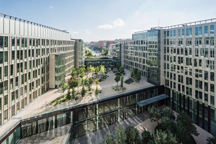
The building reflects Veolia’s social commitment. It offers employees a place of well-being, conducive to job satisfaction. The U-shape contributes to creating a place which is at the time protective with large interior gardens, opening onto the dock, urban and inviting. Opposite the boulevard, the building becomes a representative, defining structure in a dense metropolitan landscape.
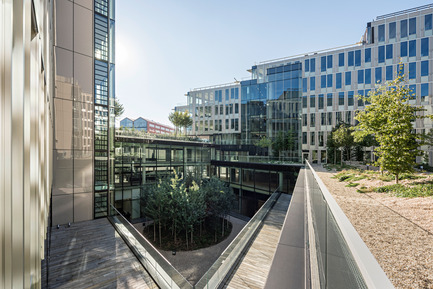
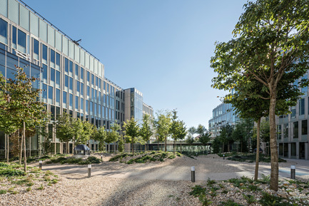
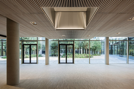
Gardens are created in the very centre of the building on different levels. They provide a new geography and a protective, inviting central area for users.
The providing of a well-defined urban transition on avenue Victor Hugo contributes to establishing continuity while providing a noise screen for the plot. The project defines the developing neighbourhood by asserting an urban density.
Towards the east, the project opens up widely onto the dock and the public space, unveiling its inner character.
In the upper levels, successive setting backs allow the sun and daylight to penetrate into the centre of the project.
The volume forms an entity giving the building a strong identity.
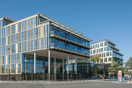
The façades consist of high grade materials in direct contact with the public space. The project creates a true urban community, enhancing the living environment. The building shows itself to be an open, inviting place comprehensible both by its users and passers-by and residents.
The building’s transparency, its dialogue with the immediate environment and its environmental performance illustrate Veolia’s values, namely responsibility, solidarity and respect. The presence of water with the dock bordering the site is an additional symbol, with the management of water being one of Veolia’s historical sectors.
The choice was to create a true campus focusing on knowledge, innovation and coming together to create a working environment at the forefront of modernity and to confer a strong identity to this unique place.
Operation
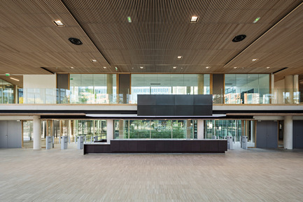
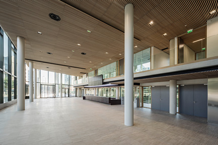
Organised on eight levels of superstructure and three levels of infrastructure, the new headquarters lies within the plot boundaries. The low levels accommodate the common areas, the reception areas, a conference centre and dining areas in particular, on which are located the office spaces.
Three halls provide access to the building. The main hall faces towards the dock, hall 2 is located at the corner of rue Anne-Marie Fettier and avenue Victor Hugo, hall 3 at the corner of the V2 road and avenue Victor Hugo. The forecourts in front of these halls are the only points of the project set back from the alignment.
Each of the halls is two floors high, representing key points on avenue Victor Hugo and rue Madeleine Vionnet. The three halls are connected inside the building by walkways which also serve the conference centre, the Agora space and the peripheral meeting spaces.
All the vertical walkways are directly connected with the halls. Located on the lower surface, the glazed landings overlook the garden.
The stairways benefit from natural light and provide ready connections between each level. Their predominant use makes them places where people congregate.
Located on the ground floor, the Agora space is directly accessible from the main hall. The lobby is located centrally, with an amphitheatre, meeting rooms and the committee room. A delivery area is located to the north, accessible from the V2.
The restaurant area is located at garden level. An internal street between the restaurant and the cafeteria provides easy access to the dining areas from the offices. The entire area opens onto large gardens, offering outdoor dining areas and visual continuity between the two patios. Meeting rooms are also provided around the gardens. The restaurant area and the adjoining gardens are used as workspace outside lunch hours.
A salad bar is located on the second floor, looking onto the upper garden, above the main hall. It opens onto the “viewpoint”, an outdoor place overlooking the dock.
The restaurant club on the last level, on the southwest tip, offers an extended view over Paris, Montmartre and the Eiffel Tower.
Service sector spaces are organised on the upper levels. Each level can be easily divided into three separate, independent lots. This divisibility provides the spaces with modularity and open-endedness.
The Veolia headquarters reflects the company’s culture, driven by modernity and innovation. Flexible, modular and allowing group or individual work, multiple spaces are intended to encourage cooperation and the flow of ideas. It is based on a flexible occupation of space through the alternating of areas that are private and common, open and compartmentalised, opaque and transparent.
The 135cm façade frame, associated with the 540 cm structural frame provides the spaces with great flexibility, as open plan or partitioned floors. The priority is user comfort, the ambition being to create an ideal working environment, both for the good of the company and its employees, and for the town, with which it forges links binding them together.
Nature as the focal point of the project
The strong ties between the building and the gardens characterises the project. There are plants at each layer of the building, creating different moods: gardens at garden level on open ground with high-leafed trees, planted terraces on the 1st and 2nd floors and vegetated roofs. It is the project’s main theme and earned it its selection as a pilot project for the new Biodivercity label.
The various outdoor spaces are inspired by natural environments providing a valuable staging for plants and forming islets of freshness. The selected species change colour during the seasons and alter the perception of spaces.
The building is consistent with the spirit of the millennium park and its areas of heavily planted groves, with the idea of establishing a plant heritage.
The free geometry of the gardens is opposed to that of the building to highlight them by contrast.
The vegetation arrangement defines intimate, inviting spaces allowing people to escape from the urban context and gather under trees, take a coffee in a clearing or enjoy the view over the dock from the viewpoint.
Employees can enjoy pleasant views in the direction of the water (the dock) and natural surroundings (gardens and terraces). These green spaces provide a place for users to
– eat (open patios on the company restaurant)
– work (large planted terraces accessible from the offices to shut themselves off from others and work outdoors)
– meet (the planted terrace can accommodate events and presentations)
– relax (viewpoint accessible from the cafeteria/salad bar with pleasant views over the dock)
The plant species were chosen in cooperation with an ecologist to ensure a range of native species, requiring minimum upkeep and promoting biodiversity.
The project creates open ground areas used to infiltrate all excess rainwater on site. The terrace roofs and slabs are extensively and semi-intensively planted, thus generating additional prior water retention. The plot’s global waterproofing factor after the work will not exceed 77%, leaving 23% of the surface over which water can seep.
Façades
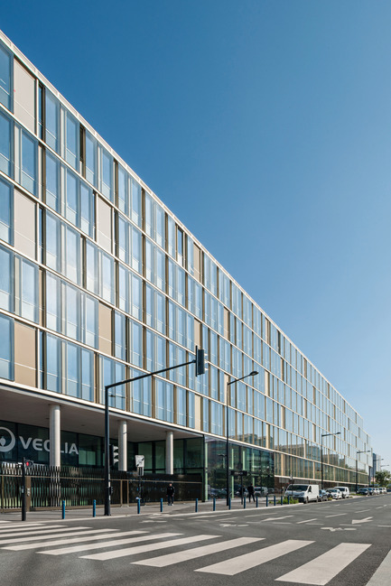
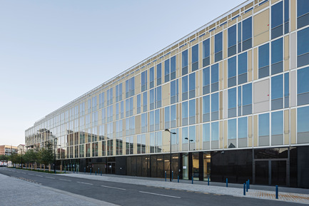
The façades meet the requirements urban location and direction. They differ according to their location, overlooking the garden or the street, and according to the direction in which they face. The layers are emphasised by horizontal elements placed at the slab nosing. In each of these layers, a vertical style is differentiated according to the various façades: window breast of constant height in the upper surface, and variable height in the lower surface, in relation with the garden movements.
The façades consist of an alternation of fixed glazed parts and opaque openings for the convenience of users. These openings also provide for natural smoke extraction in the case of non-partitioned floors.
The common façades are maintained using cleaning devices on the roof, except for the type provided with passageway to the west.
West façade on avenue Victor Hugo
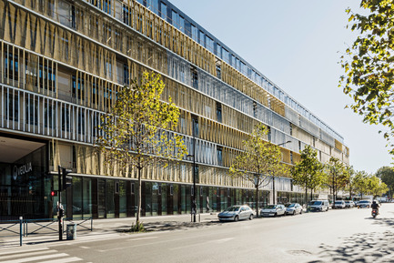
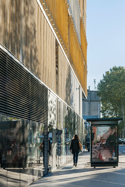
To the west on avenue Victor Hugo, the building is characterised by an outer skin separated from the glazed façade by a maintenance passageway.
It consists of motor-driven, perforated vertical slats (“Twists”) and forms a dynamic solar shading skin, supplemented by manual interior blinds. The “Twists”, consisting of vertical trapezoidal aluminium slats, rotate along a vertical axis. Their rotation and their position change the perception of the building on the avenue.
The alternation of an anodization with more or less dense pale yellow and silver colours, combined with the varying openings of the twists, punctuate the west façade. It varies with the seasons and according to the time of day.
South façade on rue Anne Marie Fettier
The south-facing façade giving onto rue Anne Marie Fettier is a ventilated double-skin frontage.
Outside, a one-piece laminated single-glazed window over the entire floor height is held vertically on both sides. This glazing is interrupted at the level of firefighter accesses and openings. Sun protection, incorporated in the ventilated air slat, is provided by a motor-driven canvas blind. The coffering of blinds are secured and concealed behind aluminium formed marking a horizontality at the floor nosings.
The exterior blinds of the façade glazing are maintained from inside through openings which also allow the maintenance of the insides.
Façades overlooking the garden
The east-, south- and north-facing façades overlook the inner garden.
They consist of curtain wall type blocks over the floor height, placed side-by-side over a width of 270 cm and fastened to the floor nosings with incorporated window breasts of varying heights. These window breasts are covered with overlapped glass elements.
Sun protection of the glazed parts of the south- and east-facing façades is provided by a motor-driven exterior canvas blind. The north-facing glazed parts of the façades not exposed to sunlight are provided with interior blinds.
The façades directly overlooking the stepped terraces in are provided with comfort openings over the entire floor height without window breasts.
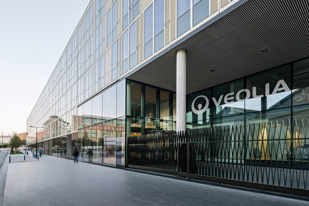
Base façade
The base consists primarily of glazed woodwork. It also includes opaque glazed areas on concrete walls. Located at garden level on the first floor, this typology includes parts two floors high and corresponds to the common spaces. Sun protection is provided by motor-driven interior blinds.
Techniques and interior spaces
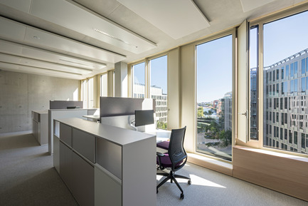
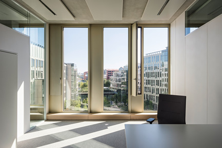
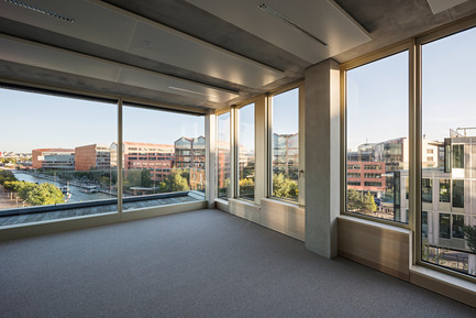
Innovation also includes technical equipment. Cold water is produced according to a water evaporation principle: the air passing through a wet heat exchanger is cooled. The office spaces are ventilated by panels located under the slabs. The inertia of the concrete left in the rough state provides a consistent, comfortable atmosphere. Lighting and acoustics are included in the panels.
The lack of a false ceiling allows free heights of 305 cm in the offices.
The floors are 18 m wide providing for offices receiving direct daylight and a central area not receiving direct daylight, primarily occupied by meeting rooms, relaxation spaces and archives.
The materials are kept in their rough state. Visible ceilings and walls are made of pale concrete, and the hall floors, the dining areas, the amphitheatre, the Agora space and lift landings are made of light oak. The materials are selected in accordance with maintenance recommendations and their low level of emission of volatile organic compounds (VOC).
The stairs are located on the façade and are widely glazed on the outside. They encourage users to use them to access the various floors. They are inviting, promote discussions and provide a tangible daily saving of energy required to operate the lifts.
An exemplary environmental approach
The building complies with the best HQE and BREEAM certified sustainable development standards, providing an energy consumption (electricity, gas, heating and air conditioning) of 30% below the standard. The project is also a pilot project for the new Biodivercity label aimed at promoting and enhancing biodiversity in constructions.
Spotlighting
The nocturnal surroundings of the Veolia headquarters are contrasted and vibrant. The shopping centre deploys all its lights opposite a set of offices illuminated at night by the functional lights of their floors. The central pool provides a night-time “breathing space” with all the surrounding lights reflected in its blackness. The night project provides a connection between the interior of the Veolia building and the pool outside.
The landscaped interior courtyard provides a continuation of the pool’s “black surface” and retains the illuminated ambiance of the reflections in the water. It offers another subtle, quieter and intriguing night landscape revealing the depth of the islet.
The façades along avenue Victor Hugo have a more urban feel. Their illumination at night – with the “twists” lit at the foot of the slats – asserts the headquarters in the avenue.
A general light gradient provides a progression between the urban façades and indoor gardens. From an architectural lighting providing a view of the building on the Victor Hugo side, the project gradually moves towards a more vaporous highlighting of the interior gardens.
All this lighting materiality gradually decreases towards the dock to highlight the brightness it provides.
Dietmar Feichtinger Architectes
With about thirty employees, the team operates mainly in Europe. DFA has built a strong eputation for its inventive structures and its investigative approach to design. Its work links both architecture and engineering whilst exploring the dynamics between these two disciplines. In a constant strive DFA is looking for integrating environmental and sustainable development, in an legant and sensitive architecture, respectful of nature and humans.
– 30 –
- Dietmar Feichtinger Architectes
- Raffaela Schmied, Press officer
- r.schmied(at)feichtingerarchitectes.com
- +33 (0)143711522
Hertha Hurnaus

Hertha Hurnaus
Hertha Hurnaus
Hertha Hurnaus
Hertha Hurnaus
Hertha Hurnaus
Hertha Hurnaus
Hertha Hurnaus
Hertha Hurnaus
Hertha Hurnaus
Hertha Hurnaus
Hertha Hurnaus
Hertha Hurnaus
Hertha Hurnaus
Hertha Hurnaus
Hertha Hurnaus
Hertha Hurnaus


