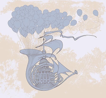
Contrast is probably one of the most important tools for designers and illustrators to make their work stand out and look professional.
LEARN FROM US:
Access All Our Courses For Only $19/mo – and Master Graphic Design at your own pace:
NEWSLETTER:
READ OUR BLOG
https://yesimadesigner.com/blog/?utm_source=youtube.com&utm_medium=referral&utm_campaign=theory&utm_content=contrast-1
FOLLOW US
https://www.instagram.com/yes_im_a_designer/
PODCAST
Apple – https://podcasts.apple.com/gb/podcast/yes-im-a-designer-podcast/id1462185547
Spotify – https://open.spotify.com/show/2vdeYhJimT7CXTVc09zfoA
ADOBE CREATIVE CLOUD
If you don’t have a Creative Cloud subscription yet, you can subscribe to it here:
https://clk.tradedoubler.com/click?p(265883)a(2929456)g(22913796)url(https://www.adobe.com/creativecloud/plans.html
(*We are partners to Adobe. If you purchase through this link you also support our channel.)
BECOME OUR MEMBER:
https://www.youtube.com/channel/UCT_of6HCtVZFpnnnLUeAGYA/join
Milanote board (with links to every artwork in the video): https://app.milanote.com/1JAC5J1OmhtY9c
Recommended videos:
Color Theory Part 1:
Color Theory Part 2:
Chapters:
0:00 Intro
0:38 Inspirations / Resources
1:10 Why is contrast a Design principle?
2:14 Examples of Contrast with Shapes / Storytelling
4:17 Juxtaposition / Scale
6:36 Contrast on the focal point
7:32 Depth and Distance
9:04 Contrast with limited Color Palette
11:12 Multiple Contrast in Illustration / Lack of contrast
14:35 Contrast examples in Photography
15:13 Low / Mid / High key contrast
18:12 Summary
source


