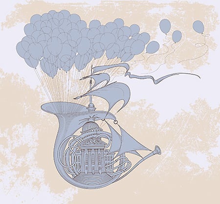
Today we have another theory based tutorial for you, involving producing a gig poster!
Check out how to structure a gig poster so that the most important information for the viewer is prioritised and clearly communicated within the design! This structure is referred to as the hierarchy of information within your design!
Understanding hierarchy is an incredibly important theory to get to grips with. It ensures your viewer takes away the right information from your designs which is especially important in areas like poster design, billboard advertisement etc!
Take a watch and try out these tools and techniques to create a clear hierarchy within your own creative work. Be sure to let us know how you get on!
Remember to check back tomorrow! If you miss a few days don’t worry, keep an eye on our playlists to find monthly roundups of our 365 tutorials.
If you want to find out more about 365 Days Of Creativity, and how you can collaborate and get involved check out our brand new blog post at:
Support us on our Patreon page to download working files, commentary videos and loads more: https://www.patreon.com/yesimadesigner
source


