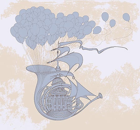
The fastest way to get better at graphic design is by analysing other people’s work and finding ways to improve it. In this video, I will demonstrate how a notebook cover design created in Adobe Illustrator can be taken to the next level by applying some simple compositional techniques.
ARTWORK BY PRO MEMBER STUDENT
Sabiha Rishan
https://www.instagram.com/caramel_muse/
NEWSLETTER:
LEARN FROM US:
Access 200+ hours of training videos and get feedback on your work:
READ OUR BLOG
FOLLOW US
https://www.instagram.com/yes_im_a_designer/
PODCAST
Apple – https://podcasts.apple.com/gb/podcast/yes-im-a-designer-podcast/id1462185547
Spotify – https://open.spotify.com/show/2vdeYhJimT7CXTVc09zfoA
Chapters:
0:00 Intro
0:24 Analysing artwork
2:26 Target audience
3:15 Design Appeal
5:00 Visual Center/ Text improvements
12:24 Touch Type Tool
13:29 Integrating Layers more
16:23 Scale things up
18:10 Make design more fun
source


