SAY NO MO
ABOUT | CONCEPT | FUNCTIONALITY | DESIGN | TEAM | PROCESS
Architects: balbek bureau Slava Balbek, Sofiia Hupalovska, Nataliya Stukonog
Project manager: Natalia Kozak
Project Area: 200 sq.m
Project Year: 2020
Location: Kyiv, Ukraine
Photo credits: Yevhenii Avramenko
Project Year: 2020
Location: Kyiv, Ukraine
Photo credits: Yevhenii Avramenko


ABOUT
Say No Mo is a conceptually new format of a beauty salon. The ‘heart’ of the salon is a bar used for both beauty services and traditional cocktail receptions.
The main task faced by balbek bureau from the very start of the design process was to break away from a traditional perception of a conventional beauty salon, and its gender distinction.

CONCEPT
The owner of the establishment is Canadian. In her years of working in the beauty industry, she has learned how to make a client happy. This understanding became the basis of the interior solutions delivered by balbek bureau.


FUNCTIONALITY
Say No Mo is a 200-sq. m, two-level premises in an old building in Kyiv. With the curved-walls geometry and without a single parallel wall, the place boasts 4-meter high ceilings and has a distinctive atmosphere.
The ground level of the salon features several zones: reception, lounge, manicure/bar, and pedicure. The basement level contains a make-up zone, hair care, cosmetology, restroom, and facilities.
DESIGN
RECEPTION ZONE
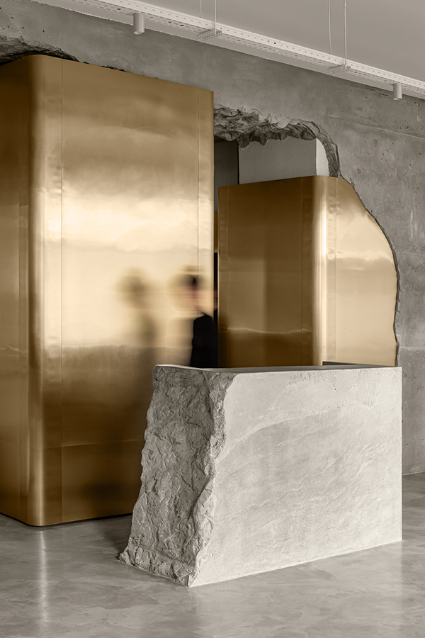
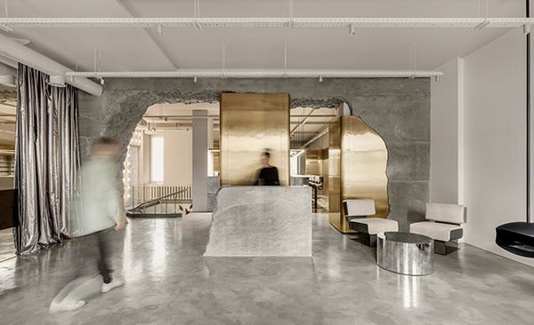
One of the main visual accents of the salon is located in the reception area. The cast-in-situ concrete ‘broken’ arch serves as a metaphor for broken stereotypes in the beauty industry.
It is made of poured concrete and weighs several hundred kilograms. The construction of this form was a multi-phased process; it took more than 4 months from the docking assembly to the final joining of shears and toning of the structure.

The reception zone has a lounge area with furniture groups and a fireplace that serves not only as a waiting area but also as a place to socialize during cocktail parties.


The reception counter is also made of cast-in-situ concrete and visually resembles a stone block. However, the monolithic look does not impede its functionality – it has a desktop and plug-in connection spots to ensure a fully functional workspace.


PEDICURE ZONE
The pedicure zone is located on podiums the ergonomics design of which is a perfect fit for nail technicians.


Podiums are equipped with integrated sliding drawers and washbasins for the use of the salon staff; during parties, they are covered with hollow coffee tables. In the middle of the zone, there is a free-standing washbasin that was assembled from two Soviet-era baby bathtubs.

Overall, the pedicure zone is finished in light tones with contrasting golden accents, giving it a feeling of cleanness.


MAKE UP AND HAIR STYLING ZONE
Salon’s ‘-1’ level is located on the basement floor. Given the lack of natural light, low ceiling height, and small square area of the premises, the entire floor has been finished in white, with the maximum use of mirrors, which visually made the space look light and airy.


BAR ZONE
Another main element and a signature mark of the interior is a set of the rounded ‘golden’ panels. Their shape envelopes the walls and columns and visually joins 3 zones: the entrance to the salon, the bar, and the pedicure zone. The panels are used in retail operations, serve as bar shelves and partitions, and mask the unevenness of the original walls.


Panels are made of polished stainless steel (0.5 mm thick) with titanium nitride coating.

The bar counter is plated with black metal with crude welding seams made intentionally prominent. The top of the bar is made of a 12-mm thick composite material.


The passage that leads to the nail art zone has a hanging hammock chair, which has become a favorite Instagram spot of the salon visitors.

NAIL ART ZONE
A 2-meter deep water basin was discovered in the nail art room during the leveling of the concrete screed. Our team decided to keep this unique feature, filling it up with balls the color of the landing; a glass floor was assembled on top of the basin.


The salon’s name – Say No Mo – is in tune with balbek bureau’s approach to this project. ‘Say No Mo’ to the traditional point of view on designing beauty salons, gender distinction, ordinary solutions. Only the flight of imagination, creativity, and aesthetics.
TEAM

PROCESS


Source: https://www.behance.net/gallery/96114587/SAY-NO-MO by https://www.behance.net/sofiahupalovska is licensed under no-use (https://creativecommons.org/licenses/by-nc-nd/4.0/deed.en_US)


